New Crest Consultation

Vote For Your Favourite Crest

  • 1

    Votes: 271 72.1%
  • 2

    Votes: 26 6.9%
  • 3

    Votes: 79 21.0%

  • Total voters
    376
  • Poll closed .
Status
Not open for further replies.
Ok, different shield I know but this design might look good in the old crest shield also. Wreaths, tower, club motto, simple, modern & classic looking at the same time, bold and uncluttered and recognizable. As for color, simple white only (everything) on royal blu background. EFC 1878 or EVERTON could be put in place of the motto. What do you think lads?
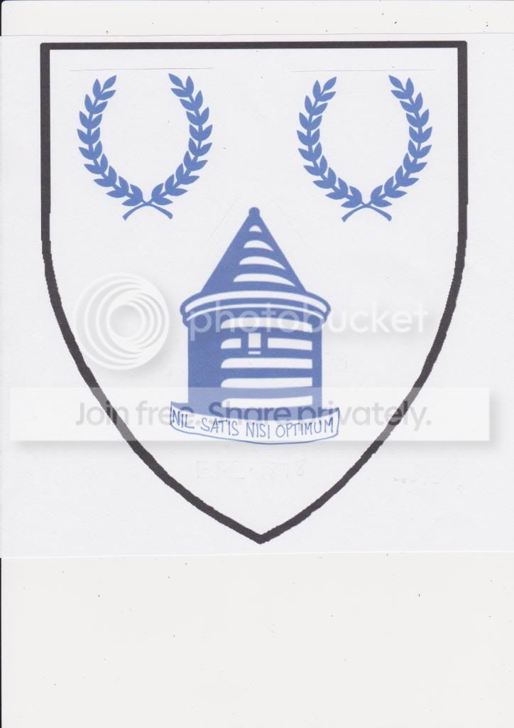
 
Sorry mate, Im not loving them, too much going on for me. Lose the Everton as we know who we are and maybe the 1878 on the tower.

The word Everton has to be on there

Not everyone is from Liverpool, not everyone has even heard of Everton. The word Everton has to be on there for brand recognition and anyone in marketing would tell you that. It's 2013 not the 1980s, football has moved on. The biggest clubs are the ones with the biggest brands, not necessarily the biggest trophy cabinets
 
1878 needs to be gotten rid of, imo. Having it on the tower looks tacky as hell.

Everton, the laurels, the tower are all must haves. NSNO too preferably if it can be worked into the logo without looking too busy.
 
I'm not a huge fan of having a shield, I would prefer it freestanding. I did really that crest from early on in the thread using the wreath as a shield.
 
The word Everton has to be on there

Not everyone is from Liverpool, not everyone has even heard of Everton. The word Everton has to be on there for brand recognition and anyone in marketing would tell you that. It's 2013 not the 1980s, football has moved on. The biggest clubs are the ones with the biggest brands, not necessarily the biggest trophy cabinets

Ok i take your point, but the font needs changing or have it all in capitals.
 
310 post and about 250 different opinions and thats just on here, multiply it out from all over everywhere and the Club will end up after exhaustive consultations with everybody and his dog ( which is exactly what we said we wanted ) with, IMO, no clear mandate and thus a carte blanche to do more or less what ever they want anyway.
 
Everton shirt cuffs are blue, only the collar is white. The shorts are white, the socks are white. There is no need for a badge on the shirt, we are the team that plays in blue and white. Everyone knows who we are. We don't need to tell them.
 
Everton shirt cuffs are blue, only the collar is white. The shorts are white, the socks are white. There is no need for a badge on the shirt, we are the team that plays in blue and white. Everyone knows who we are. We don't need to tell them.

Do they though?
 
Ok, lets see if this works. I had to take a (crap) picture of this so I could upload it. Im a massive fan of Borussia Dortmund, and love the simplicity of their badge, quite obviously my first two efforts here are similar. Thoughts?


Would love this, but with a more traditional tower instead of the beehive. Top effort.
 
8RHGYA4.png

Yes! Love this.
 
Sure mate. But realistically, people need to be introduced to the club to be able to understand.

That's the debate .. My team since 1968 (RIP Jeff Astle) ... "born, not manufactured", is for me- clearly not for you, I have no issue - we all want the best for OUR club.. I'm an old git, I get it, as my son constantly points out !!
 
Status
Not open for further replies.

Similar Threads

Welcome

Join the Everton conversation today.
Fewer ads, full access, completely free.

🛒 Visit Shop

Support Grand Old Team by checking out our latest Everton gear!
Back
Top