eigh
Player Valuation: £225k
These are decent as well.
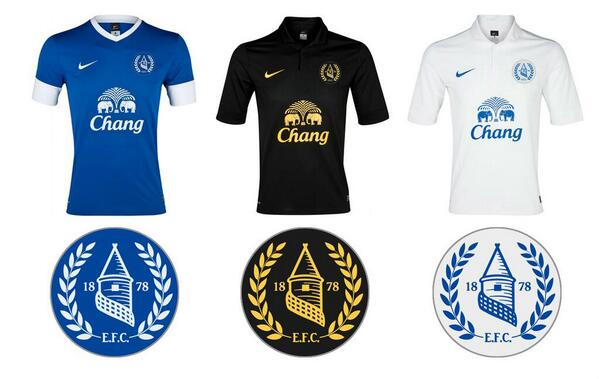
These are nice...
These are decent as well.


This is probably one of the best so far in terms of hitting the design brief on the head; it's fairly simple, clear, includes both the word Everton and nil satis which are basically none negotiable and it would be easy for the media to reproduce which was the biggest problem with the old badge

These are nice...


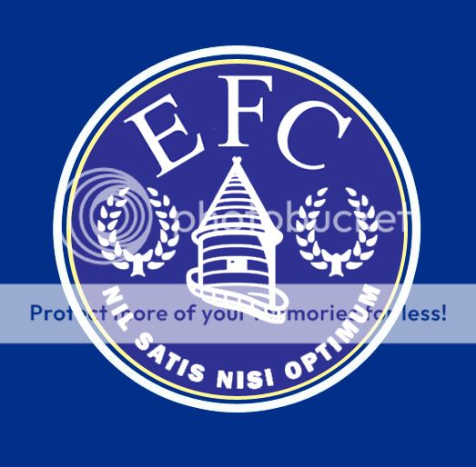

Taking inspiration from the round badge mock-ups, here's another design from me


This one would be great. It just needs "1878" on there somewhere, otherwise it doesn't meet the requirement


Join the Everton conversation today.
Fewer ads, full access, completely free.