
You are using an out of date browser. It may not display this or other websites correctly.
You should upgrade or use an alternative browser.
You should upgrade or use an alternative browser.
- Status
- Not open for further replies.
D
Deleted member 28206
Guest
Some really fantastic efforts here. Well done, I love them.
D
Deleted member 28206
Guest
My genuine favourite


Bear in mind I'm not very good with Photoshop... But you can see what I'm going for.


RFUS
Anustart
Bear in mind I'm not very good with Photoshop... But you can see what I'm going for.
Lower the wreaths to the base of the tower; it's not quite 'GOT' enough yet.
Last edited:

andy4efc
Player Valuation: £60m
My genuine favourite
The top is great, EFC needs changing, put smaller on the badge somewhere but looks very classy.

bluemangroup
Player Valuation: £70m
RFUS
Anustart
My favourite one. Brilliant and simple.
'Everton Football Club' is a bit kopite, like.
'Everton' will do. Otherwise though, yeah, I like this style of badge.

eigh
Player Valuation: £225k
I sent in this one last week, going through this thread I see its similar to others such as Jesters.

For me the most important thing is to drop the shield. Its ugly, it looks like a cheap cowboy sheriff badge and its difficult to fit things in it.
Round badges are the way to go, regardless of what you think of the likes of Bayern, Chelsea or Inter their badges look smart. Even in the lower leagues badges that are round look much more presentable than shields.
I included NSNO as I had the space too but to be honest I think it might be better to just place it on the shirt in different locations each season (back of the collar, along the sleeve etc)
It is a nice look and fits all of the elements but copies Chelsea's too much. Not that i would complain if this happened. A shield could be done if done the right way. People that have done shields have over done them. I have tried shield concepts above but just rough ideas, as I suck at photoshop.

Dom1878
Player Valuation: £60m
Concepts to claim the River Mersey and Merseyside...
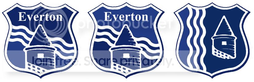

I actually really like the idea of incorporating the river mersey to be honest


barneygumble
Player Valuation: £70m
Stick the badge in a shield on the kit only if necessary, don't just throw one in for the sake of it.
See Man City this season.
http://3.bp.blogspot.com/-ydaARNON5XE/UZv9_faKTBI/AAAAAAAASOA/eUmJRTfbnZk/s363/Nike+Manchester+City+13-14+Home+Kit+emblem.jpg
See Man City this season.
http://3.bp.blogspot.com/-ydaARNON5XE/UZv9_faKTBI/AAAAAAAASOA/eUmJRTfbnZk/s363/Nike+Manchester+City+13-14+Home+Kit+emblem.jpg
barneygumble
Player Valuation: £70m
Who ever mentioned the mersey, it'd be brilliant imo, I'm still keen on having the Wreath's and Tower, so i wouldn't knowto incorportate it, but the one on the other page looks brilliant.
If that shower have the Liver Birds, then We may aswell take our own little part of merseyside and stick it on our crest.
If that shower have the Liver Birds, then We may aswell take our own little part of merseyside and stick it on our crest.

blaze
Player Valuation: £950k
I like a couple of the designs in this thread, but as pointed out, people need to remember it's about brand recognition more than ever these days and having Everton on there is going to be needed. I actually wasn't a fan of the redesign we have now and I still think it looks pretty amateurish on most things, but when it's displayed on tv, it does it's job well enough. The idea behind it is a good one, it possibly didn't even need massive amounts of work, some tweaking of the design, including certain aspects of the old design would have likely got a better response.
eigh
Player Valuation: £225k
Stick the badge in a shield on the kit only if necessary, don't just throw one in for the sake of it.
See Man City this season.
http://3.bp.blogspot.com/-ydaARNON5XE/UZv9_faKTBI/AAAAAAAASOA/eUmJRTfbnZk/s363/Nike+Manchester+City+13-14+Home+Kit+emblem.jpg
I get your point but I don't look at it that way since the shield has been apart of 5 out 10 crests
- Status
- Not open for further replies.
Similar Threads


Welcome
Join the Everton conversation today.
Fewer ads, full access, completely free.