

DanEFC92
Player Valuation: £90m
I doubt you would really, and certainly not enough to outweigh the serious entries.
Reason I bring it up is that it's on RAWK.
But you're probably right.
I doubt you would really, and certainly not enough to outweigh the serious entries.

Why is the online petition open for everyone? Bound to get a load of wide up attempts.

Ok, lets see if this works. I had to take a (crap) picture of this so I could upload it. Im a massive fan of Borussia Dortmund, and love the simplicity of their badge, quite obviously my first two efforts here are similar. Thoughts?
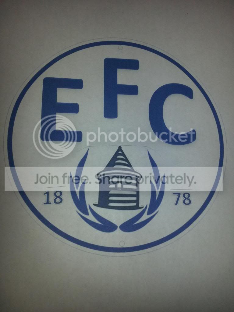
Ok, lets see if this works. I had to take a (crap) picture of this so I could upload it. Im a massive fan of Borussia Dortmund, and love the simplicity of their badge, quite obviously my first two efforts here are similar. Thoughts?

Why is the online petition open for everyone? Bound to get a load of wide up attempts.

Also, the actual crest vote will be only open to people with customer numbers which will stop windups voting for rubbish ones.

What do you prefer, rank your favourites of the following:
6
Six
VI
Half a dozen
2x3

They need to [Poor language removed] off with this requirement to have EVERTON in massive Comic Sans taking up half the badge.
Branding us to Billy Bob in Delaware or Pyon Ting in Shanghai isn't going to bring in that much extra revenue. Just knowing the club's name isn't going to bring in millions of new fans.
Having a boss badge on a nice shirt at a decent price will create far more revenue for the club. Be arsed with the f*cking Sky Super Tuesday sponsored by Tampax and f*cking Kelloggs generation, with their requirement to have everything streamlined and easy to digest
Tower. Laurels. Nil Satis. Everything else is unnecessary window dressing.

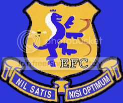

I'm ready to be negged, but I like the questionnaire and think it's a good idea. There are a lot of wonderful designs here, but few of them are more useful than uploading to FIFA. Most are too busy to be more than concepts, and while I understand that many teams have a busy crest, few are revising their club brand to become more busy. The old crest was too busy; too many colors, too many details. The club should preserve all of these details, but not in one place.
I expect the club will preserve all of these details, but not all on the new badge. It seems clear to me that they're putting up the name, the tower, and one element. I presume they'd like to keep the badge shape because it's uncommon for top-flight teams. Who use it besides Everton and Barcelona? They may be more open to change, but I suspect not. I can't see the wreaths staying, except in a more abstract form. The questionnaire is helpful for determining what the supporters value, it's helpful for "educating" (or leading as others have suggested) supporters on brand values, and it's helpful for the club to build the PR strategy for the new crest/badge. I don't have a problem with this (although I also find the new badge acceptable, even if I would prefer it only in blue/white).


Join the Everton conversation today.
Fewer ads, full access, completely free.


