New Crest Consultation

Vote For Your Favourite Crest

  • 1

    Votes: 271 72.1%
  • 2

    Votes: 26 6.9%
  • 3

    Votes: 79 21.0%

  • Total voters
    376
  • Poll closed .

Join the Everton conversation today.
Fewer ads, full access, completely free.

Status
Not open for further replies.
They need to [Poor language removed] off with this requirement to have EVERTON in massive Comic Sans taking up half the badge.

Branding us to Billy Bob in Delaware or Pyon Ting in Shanghai isn't going to bring in that much extra revenue. Just knowing the club's name isn't going to bring in millions of new fans.

Having a boss badge on a nice shirt at a decent price will create far more revenue for the club. Be arsed with the f*cking Sky Super Tuesday sponsored by Tampax and f*cking Kelloggs generation, with their requirement to have everything streamlined and easy to digest

Tower. Laurels. Nil Satis. Everything else is unnecessary window dressing.

I agree Jockles. It's not like it's a logo and we plaster it in places it doesn't belong, we don't get fans because of brand recognition when someone walks in to a shop, especially when we sell our kits in literally 6 shops worldwide. It's a badge, it's an emblem, it's our coat of arms and should represent the club.
 
bji4.jpg


This is probably one of the best so far in terms of hitting the design brief on the head; it's fairly simple, clear, includes both the word Everton and nil satis which are basically none negotiable and it would be easy for the media to reproduce which was the biggest problem with the old badge

Looks a bit TOO plain, and not as classy as the Jester 1.

Also, no 1878.
 
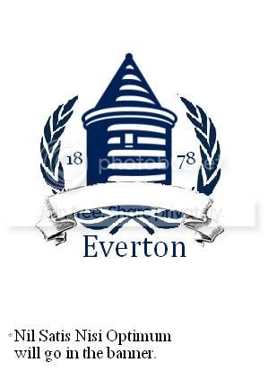
Go, go Microsoft Paint skills. The proportions are a bit off, and because it is Microsoft Paint, I can't wrap text or do anything fancy.

EvertonCrestAttempt1_zps1cfba493.jpg
 
They need to [Poor language removed] off with this requirement to have EVERTON in massive Comic Sans taking up half the badge.

Branding us to Billy Bob in Delaware or Pyon Ting in Shanghai isn't going to bring in that much extra revenue. Just knowing the club's name isn't going to bring in millions of new fans.

Having a boss badge on a nice shirt at a decent price will create far more revenue for the club. Be arsed with the f*cking Sky Super Tuesday sponsored by Tampax and f*cking Kelloggs generation, with their requirement to have everything streamlined and easy to digest

Tower. Laurels. Nil Satis. Everything else is unnecessary window dressing.

You sound like that auld sod who was miking the applause before the West Brom game just for being old :lol:
 
Last edited:
Yeah, you can tell what the club want by the last 2 designs we've had, and I can see why they would want them too.

I've always been of the opinion that our badge is 1 of the more easily recognisable and iconic badges, and that without the need for the name to be shown. But that is obviously not who we are aiming for with the rebrand. The rebrand is to make us instantly recognisable to people who are getting in on the ground level.

Me and my brother where in Florida last year, and asking if the Everton game was being televised anywhere, it was like we where speaking a different language... "Averdon?" "Airviten?". I do think a cleaner, more focused badge with our identity for all to see will help that.

And the year is a big thing as well. Heritage in these situations is massive, especially when people see we where here 1st. It lends weight to how big we where and could be again, instant history lessons to those uninitiated.

That Jester badge highlights just about everything in a smart, clean, and most importantly, simple and easy to read badge, keeps all the elements we want, and without looking busy or cluttered.

Excellent work

When I was in Florida, I got free drinks for wearing my Everton shirt.
 
What we're told about marketing strategies makes sense, but it's hard to accept coming from the mouths of those currently running the club. It would be easier to take their plans for expansion more seriously if they had other, bigger ideas as well, but they don't. The absolute best they can do to raise the club's profile is write 'EVERTON' on the badge. They have nothing else.

You make new fans abroad by having exciting players in your team. Everton missed the chance to sell a huge amount of shirts when they couldn't hold on to Wayne Rooney for more than two seasons. I also think they missed a trick by not doing more to bring in Donovan on a permanent deal.
 
I thought the whole badge saga was there because fans are unhappy with the badge change, and the board was unhappy with our old badge because it simply doesn't work in a contrast-based setting?

I suggest we should try something new. The most important thing on our brand image - a unified design to be used as the shirt badge and everywhere else - should be the tower. There should be nothing fancy to obscure the view or to distract the viewer: NSNO, 1878, Laurels, or even the words "Everton" itself should work to enhance image of forcefulness, stability, commonality, and somehow proletarian feel of the tower.

The laurel can stay, and should go around the tower, but again not too prominent. There could be space for one set of ribbon, and Either on both arms as 18/78, or split in three as Nil Satis / 1878 / Nisi Optimum.
Now, Everton is probably too big to fit, and in an extended version of our brand the name "Everton" with or without football club should go alongside the badge version anyway, so just try EFC. It could replace 1878 as Nil Satis / EFC / Nisi Optimum, but I would suggest the letters EFC form part of the tower itself, as some kind of subtle reminder.
 
This is a really rough go I had trying to get everything into a badge (tower, shield, wreath, date, nsno, full name). Any attempt (like this one) to do that just ends up so fussy and cluttered. Will be really interesting to see what we end up with and the route we go down...

lff7.jpg
 
This is a really rough go I had trying to get everything into a badge (tower, shield, wreath, date, nsno, full name). Any attempt (like this one) to do that just ends up so fussy and cluttered. Will be really interesting to see what we end up with and the route we go down...[/IMG]

Is kind of the point I think. Personally I'd lose date and NSNO from crest, plenty of other places we can use NSNO.
 
Is kind of the point I think. Personally I'd lose date and NSNO from crest, plenty of other places we can use NSNO.

Me too. Think they are the least important on an actual crest. Most teams have a motto, it just doesn't feature on the badge. We could have NSNO on the collar or something. I personally would prefer EFC over Everton too.

I think at least two of the 6 elements have to go for the new crest to work. This is obviously what they did with the new badge, they just did it badly...
 
Last edited:
Status
Not open for further replies.

Similar Threads

Back
Top