New Crest Consultation

Vote For Your Favourite Crest

  • 1

    Votes: 271 72.1%
  • 2

    Votes: 26 6.9%
  • 3

    Votes: 79 21.0%

  • Total voters
    376
  • Poll closed .
Status
Not open for further replies.
I guess I never really thought of the Everton (and the 1878) on the 2000 badge as being 'part of the crest'.

While I'll admit this isn't the biggest problem with the designs, its these small considerations that can make a difference between a design looking amateur and looking polished. The 1991 crest is my favourite, for what it's worth.

You're right. Sometimes it is all in the little details. Well I have more issues with the actual shape of the shield. The soon to be newest is the worst as it got more boob looking. The 1920 shield is the best.
 
You're right. Sometimes it is all in the little details. Well I have more issues with the actual shape of the shield. The soon to be newest is the worst as it got more boob looking. The 1920 shield is the best.

The tower, that's what's wrong with these designs. It's a poor representation.

This took me 2 minutes, with a tower someone else created:

c1kv.jpg


All three look better to me with a decent tower like that.

disagree. Looks like the tower is melting away.
 
Number one for me all day long, but to be honest I'll be happy with anything that doesn't have any yellow on it. I always hated the yellow on our last badge, looked too toyish to me. The first one has a clean, retro look about it and looks great on the shirt.
 
Ok this is my first post so please be kind! I work in Graphic Design so for obvious reasons this entire new crest saga / nightmare has given me many a sleepless night in the last few months!!!

Now I know a lot of people are making their own versions of the badge and I've seen some really really good designs but I think we all know that unfortunately the club would never fully allow one of these to be the badge, however much fan support it got

But the Graphic Designer in me just can't stay away from this subject any more so I have had my own go at the badge 'gasp'

However I've taken a slightly different approach...

We all know Option A is going to win the vote and it is the clear choice as it includes all of the components that any fan could possibly want, however I think the overall design just needs a little tweaking to bring the whole thing together

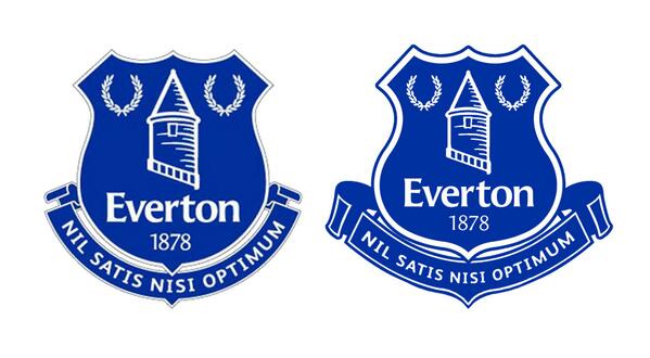
So here is my attempt at doing just that, essentially all I've done is reshape the shield and banner but I honestly think this works a lot better - without going against the clubs own approved design components

large


As I said I'm new to the forum so hopefully that actually worked

Right...you can now commence constructively critiquing it :)
 
Is that what you were trying to post? I like it - the white border especially. Has more weight to it.

Edit: though it's the fat shield shape... that one just seems too unathletic to me. Scroll is better on yours, though.

It is, but I see what he's done - giving the shield more definition away from the scrolls is a good thing, IMO....and I dont think the bulbous bottom of the shield is quite as large as on the current monstrosity.
 
It is, but I see what he's done - giving the shield more definition away from the scrolls is a good thing, IMO....and I dont think the bulbous bottom of the shield is quite as large as on the current monstrosity.

You're right - but a similar shield to the 'classic' badge would work just as well, without the bottom-heaviness.

But that's not to do the lad's work down - it's definitely better than the official design.
 
h t t p : / / i . i m g u r . c o m / v 4 W L 5 X x . p n g

h t t p : / / i . i m g u r . c o m / h R s G V f P . p n g

Had a go at an Arsenal inspired shield.

The more i look at the first badge the more it is acceptable i suppose. The three of them all still look like early designs. Where's the polish and finesse?
 
You're right - but a similar shield to the 'classic' badge would work just as well, without the bottom-heaviness.

But that's not to do the lad's work down - it's definitely better than the official design.

A fan with design experience. You'd think the clever people at the club might have explored that avenue.
 
h t t p : / / i . i m g u r . c o m / v 4 W L 5 X x . p n g

h t t p : / / i . i m g u r . c o m / h R s G V f P . p n g

Had a go at an Arsenal inspired shield.

The more i look at the first badge the more it is acceptable i suppose. The three of them all still look like early designs. Where's the polish and finesse?

v4WL5Xx.png

hRsGVfP.png


Really like the one without the yellow
 
No offence PJ but I hate that design. It's the same fat arsed shield, the white space outline is too thick to be consistent with the rest of the design (thin lines on shield/tower) and there's too much blue space below the "Nisi" in the banner.
 
No offence taken at all and thank you to everyone for your comments thus far, and especially to Allen for uploading the pic for us

Personally, I'm a fan of the thicker white line not matching the tower but will agree about the consistency with the banner, that was more of a time constraint as I simply nicked the old banner to use rather than the new one which is another reason for the extra blue space around the NISI that I would prefer not to be there but again was working quickly with the clubs new version of the text

Interesting to hear people's comments about the shape of the shield, which you rightly guessed was borrowed from the current badge and as much as I don't like the current design I do prefer how the lines of the shield taper into the point at the bottom rather than it looking like someone stuck a triangle on, which is how I see the new options

And I did my best to reduce the 'fat arse' (love that name for it by the way) by pinching it down a bit but maybe didn't succeed enough in that respect
 
Status
Not open for further replies.

Similar Threads

Welcome

Join the Everton conversation today.
Fewer ads, full access, completely free.

🛒 Visit Shop

Support Grand Old Team by checking out our latest Everton gear!
Back
Top