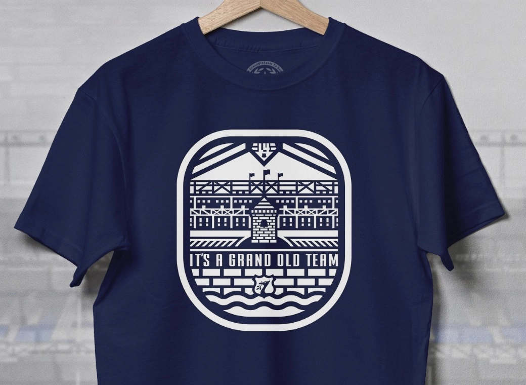
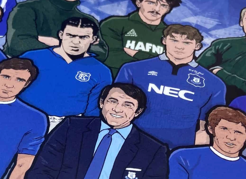
Everton branding

Status
Not open for further replies.
On my word... who comes up with this [Poor language removed]?

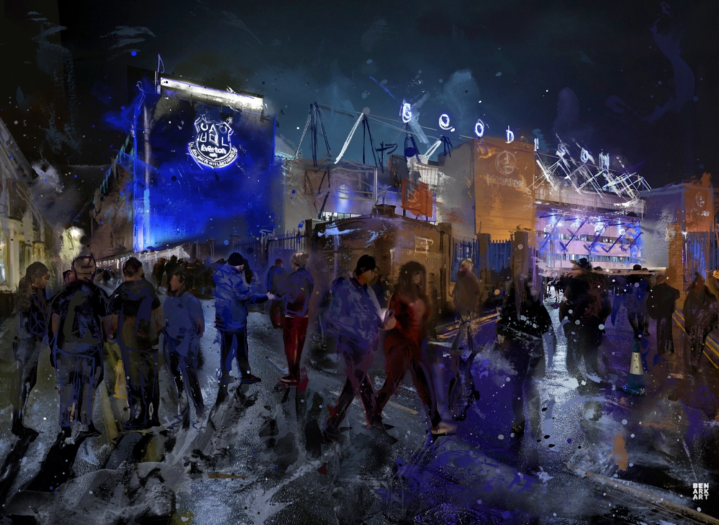
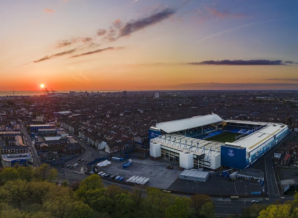
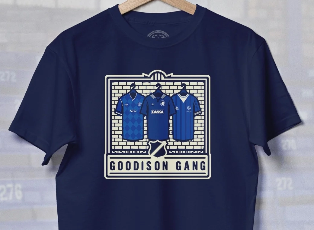
Everton has always led by example. Their new visual identity is built on the club’s deep morality: a bold, unapologetic system of expression that gives a fresh voice to a legacy worth taking part in.

Who in f's name is that supposed to resonate with?
 
Im a graphic designer and artist for what its worth. I think the font design is interesting and can overlap nicely with more classic aesthetics and contemporary needs. But just broadly speaking I think the push into a minimal design, vector based stark elements would not have been my direction. One of the sells of Everton is history and tradition, let alone locale, goodison and liverpool broadly. Personally leaning into vintage designs in interesting ways I think would be more my leaning (thinking of Man U's design campaign last season mimicking 70s posters etc). I think things more textured from the ad campaigns and kits would be welcomed. I dont like to be mean but again this is a bit in my field. Hummel this season has been border line negligent. Even in their own belief in loud and bold choices was the go, the tessellations, colorways and details honestly seem amateurish.

I think theres a lot of potential for most clubs to be a little more creative with marketing so I don't mean to single us how. But Hummel and this Design team I think are shooting for the wrong marks.
 
I think this is clearly about money.

Create a simpler logo then get it everywhere and make it recognisable in peoples consciousnesses around the globe, so that people know it’s Everton. That’d be the goal.

And ultimately it’ll raise the clubs profile and bring in…money, which we can then pour down the drain again.

The corporate machine of Togger.
 

Moan when they dont, moan when they do. Kin'ell people.

I'm all for the club 'tryin' new tings n da'

Go and eat some Jamie dodgers or something.
 
you're mixing up your opinion of the outcome to the process.
Like I said, it's not about whether you like it or not.
The club has slowly seeded this over the past 18 months or so, creating a brand that will be unique.
They've carried out the process the correct way, whether you're happy with how it looks is not the point I'm making.
I'm impressed with the way the club have developed this.
Well you maybe should tell this to some others on here who believe this Tower brand not to be in takeover mode.

That's not me. I am saying - in agreement with you - that it's been a concerted attempt to usurp the club's existing identity in terms of a large part of its iconography and I decidedly dont like it.

Maybe you dont give a flying one about tradition, but I many more do.
Oh you care about tradition now? Despite you wanting nothing to do with at Bramley Moore with the Archibald? Interesting.

Anyway, I think the badge looks smart.

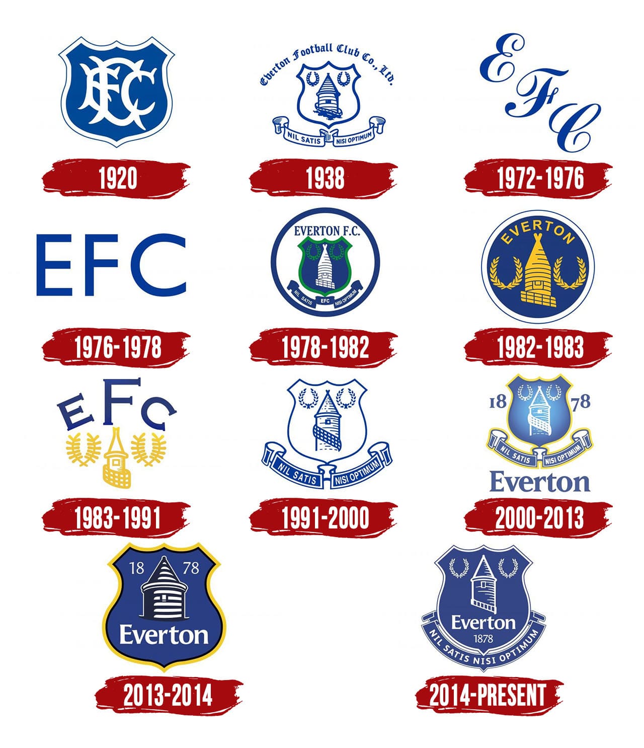
Everton-Logo-History.jpg


The club evolves.
 
Well I think it looks great - particularly in the graphic design and the animated video-led stuff. I don't think it necessarily means changing the badge either - I think they are looking for a single icon that can be used to tie together stuff across lots of platforms and probably lots of different departments within the club... and it looks modern, clean and distinctive. The agency that did it (Dixon Baxi) did the visual identity for the whole Premier League about 5 years ago, so they are proven at what they do. On the other hand, I once interviewed there and they were 100% grade A fannies. Both things can be true.
 
  • Like
Reactions: kev
Oh you care about tradition now? Despite you wanting nothing to do with at Bramley Moore with the Archibald? Interesting.

Anyway, I think the badge looks smart.

Everton-Logo-History.jpg


The club evolves.

That's not our exclusive tradition. The badge is.

FFS the fuss made of those trusses. It's a bit of metal - and the nod to them at the Everton Stadium is to put it on brickwork.

It's insane.
 
That's not our exclusive tradition. The badge is.

FFS the fuss made of those trusses. It's a bit of metal - and the nod to them at the Everton Stadium is to put it on brickwork.

It's insane.
Regardless, Dave, tradition would have us still playing with the 1920s badge.

I get it, people dont like change, but compared to that fat badge we in 2013, its not the worst think ive seen.
 

Status
Not open for further replies.
Top