Well I quite like it and that's all that really matters as far as I can see.
You are using an out of date browser. It may not display this or other websites correctly.
You should upgrade or use an alternative browser.
You should upgrade or use an alternative browser.
- Status
- Not open for further replies.
davek
Player Valuation: £150m
"Branding the right way" = demolishing a well known image that everyone identifies with Everton for what looks like a pocket square that everyone shakes their head at wondering wtf it has to do with Everton.as opposed to 'lets keep everyone happy'
they want the name, the date, the motto, the tower, the laurels, can we cram it in to one crest, tell you what, lets make two dummy ones that are so bad everyone will pick the only passable one and all feel good about it.
Design by committee never works,
Whether you like or dislike this effort, it's good that the club are going about branding the right way.
roydo
in memoriam - 1965-2024
"Branding the right way" = demolishing a well known image that everyone identifies with Everton for what looks like a pocket square that everyone shakes their head at wondering wtf it has to do with Everton.
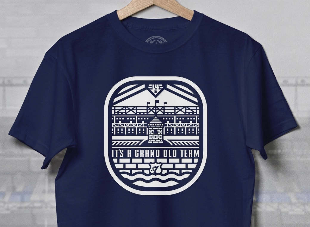
This about the seldom seen 3rd kit shirt?
If so, I dont mind it. Its instantly the tower, just with a modern twist to it. It will never make an appearance on the home and away kits, and rightly so.
But design is always a subjective opinion. Like bricks in a new ground.
windymiller
Player Valuation: £70m
"The brand owns an aesthetic that feels premium and aspirational, yet democratic and of the people, delivering excellence to those who deserve it."
Any ideas what this means? I put it through Google Translate and it just linked me to a gif of animals shagging so I'm none the wiser.
Any ideas what this means? I put it through Google Translate and it just linked me to a gif of animals shagging so I'm none the wiser.
Azza
Player Valuation: £80m
This about the seldom seen 3rd kit shirt?
If so, I dont mind it. Its instantly the tower, just with a modern twist to it. It will never make an appearance on the home and away kits, and rightly so.
But design is always a subjective opinion. Like bricks in a new ground.
Eh? It's on the back of the home and away kits.
davek
Player Valuation: £150m
I wouldn't be too sure of that. There's a video on the club site showing the evolution of the badge on the first team kit and I dont think I'm the only one who thinks they are preparing the ground for this 'Tower' to be the new badge. They are lashing it on just about everything else and it looks unstoppable.This about the seldom seen 3rd kit shirt?
If so, I dont mind it. Its instantly the tower, just with a modern twist to it. It will never make an appearance on the home and away kits, and rightly so.
But design is always a subjective opinion. Like bricks in a new ground.
Connor mcloud
Player Valuation: £15m
Let's have a poll.
Anyone asked a player from the current squad (or a previous player) for their opinions?
barneygumble
Player Valuation: £60m
roydo
in memoriam - 1965-2024
Eh? It's on the back of the home and away kits.
But not on the front though.
As in, part of the design, not the badge.
Sadly it does.
Sincerest condolences to Mrs Goat.
ToffeeDevil
Player Valuation: £20m
it's the brand consultant, of course they're gonna fluff the s*** out of their strategy
BullensRoad
Player Valuation: £35m
I like it. Embrace modernity, and make it will become recognisable.
you're mixing up your opinion of the outcome to the process."Branding the right way" = demolishing a well known image that everyone identifies with Everton for what looks like a pocket square that everyone shakes their head at wondering wtf it has to do with Everton.
Like I said, it's not about whether you like it or not.
The club has slowly seeded this over the past 18 months or so, creating a brand that will be unique.
They've carried out the process the correct way, whether you're happy with how it looks is not the point I'm making.
I'm impressed with the way the club have developed this.
- Status
- Not open for further replies.


