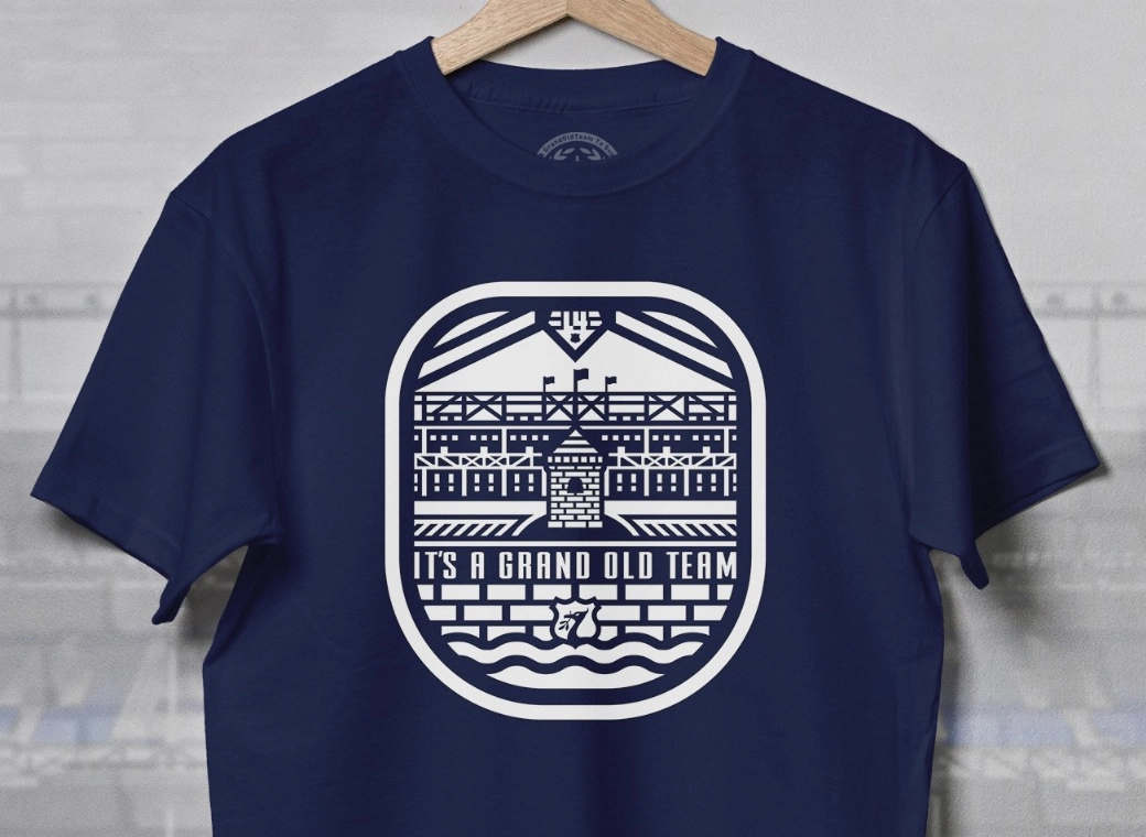
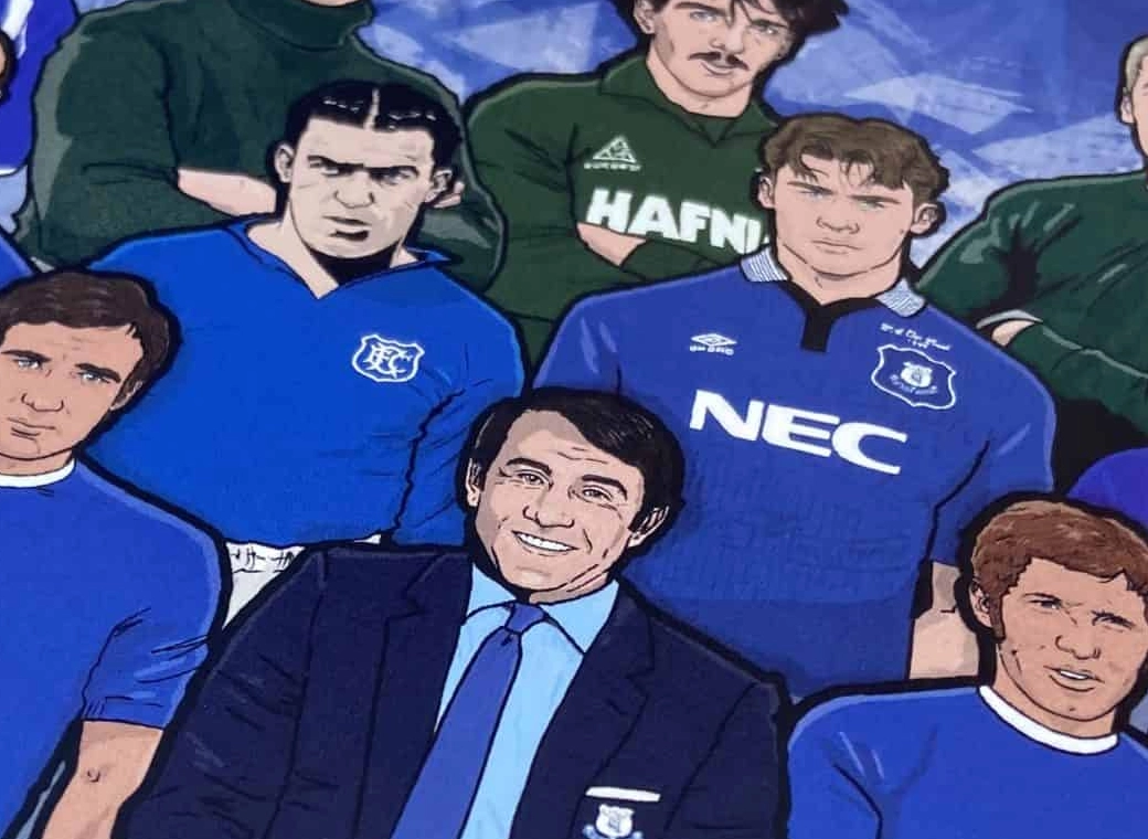
Everton branding

Status
Not open for further replies.
Nobody even speaks Latin any more.
gettyimages-1165683579-scaled.jpg
 

It is ironic that in an age where complex graphical reproduction has never been easier, football clubs come up with the argument that they need a simple badge so they can easily reproduce it on different media. We manahed to have a fancy multicoloured embroidered badge back in the 80s where you'd have to have been a pretty elite to gave a 16 colour cga monitor.

I think the bluster and drive for simplicity just masks a lack of creativity. Further irony is that the simple, uncreative, unimaginative design work probably costs a packet.
 

Penis related to the person who wrote the words. Fallic the tower shape.

Stormy Daniels... that from a rod Stewart song?
 
I think this is clearly about money.

Create a simpler logo then get it everywhere and make it recognisable in peoples consciousnesses around the globe, so that people know it’s Everton. That’d be the goal.

And ultimately it’ll raise the clubs profile and bring in…money, which we can then pour down the drain again.

The corporate machine of Togger.
If it was truly about money there would be a call to action. Some kind of offer and an opportunity to buy into whatever crap is being offered. That's how real marketing works, not this feel goody goody (or in this case baddy baddy) b/s that means diddly squat.

It smacks of typical agency nonsense of sell them on a new logo, rebrand everything, spend a ridiculous amount of money on it and make everyone feel good... only thing missing is that none of it improves the product or sells more of it. I've seen it time and time again... rinse and repeat .... and it shows the type of thinking we really have at the top of the club when they allow this utter crap to happen.
 
Oh you care about tradition now? Despite you wanting nothing to do with at Bramley Moore with the Archibald? Interesting.

Anyway, I think the badge looks smart.

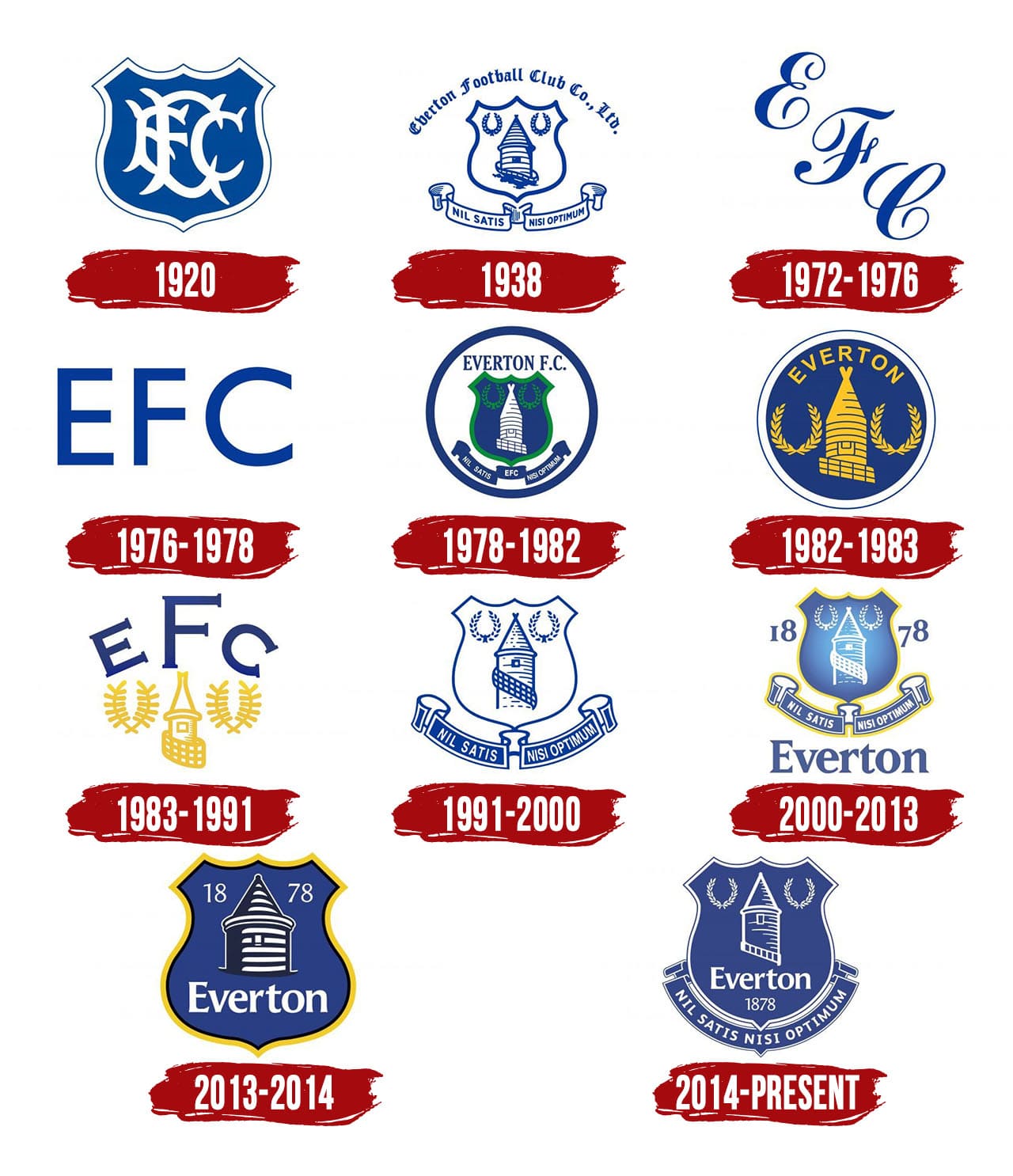
Everton-Logo-History.jpg


The club evolves.
Sure, we just need a couple of windmill vanes on it and maybe we can all watch as it sails away like a tardis.

"Nothing but the best is good enough" indeed... except for when it comes to designing a logo, doing some real marketing, having players that actually perform and an ownership that has the slightest clue in what it's doing.
 

Status
Not open for further replies.
Top