Install the app
How to install the app on iOS
Follow along with the video below to see how to install our site as a web app on your home screen.
Note: this_feature_currently_requires_accessing_site_using_safari
You are using an out of date browser. It may not display this or other websites correctly.
You should upgrade or use an alternative browser.
You should upgrade or use an alternative browser.
- Status
- Not open for further replies.
In terms of marketing I always thought it made sense to have 'Everton' somewhere on there, but whoever they've hired for this are clearly having problems making it work and it's causing the designs to have elements pushed into places that don't look good. They're all extremely poor, the first one is the best looking one but there are better fan designs than the ones we're being asked to choose from which says everything really.
Fair enough to have Everton on the external marketing stuff, for the kit I'd just go to basic.
Dom1878
Player Valuation: £60m
Prefer the current one over options 1 and 2. I like the 3rd but it wont get votes...
...as someone said on Twitter, Everton should have done 10 designs, then have a vote on the top 3, then do another poll over those 3.
Personally I'd just stick with our current one, shame that won't be an option in the vote
...as someone said on Twitter, Everton should have done 10 designs, then have a vote on the top 3, then do another poll over those 3.
Personally I'd just stick with our current one, shame that won't be an option in the vote
BirkenheadBlue
Player Valuation: £70m
Which is a great example of the sort of thinking that's partly led us to making a fraction of the overseas marketing money that other clubs make.I really don't understand the need for 'Everton' to be included; as a fan the tower and the logo say everything. The RS reverted to basics and I wish we would have done the same.
We know who we are, if nobody else does then they don't matter
Rupert's Tower
Player Valuation: £6m
I really don't understand the need for 'Everton' to be included; as a fan the tower and the logo say everything. The RS reverted to basics and I wish we would have done the same.
We know who we are, if nobody else does then they don't matter
The Premier League is a global brand, how are new fans supposed to even know who we are if our name isn't in the badge? NBC in America did a marketing thing recently where they printed all the Prem team's badge's on the carriages of the New York subway, how would people have even known who we were without the word Everton? It's narrow minded to just say 'we know who we are, why bother'
I Live in London, I was out recently wearing some gear I recently bought with the badge everyone hates on it, couple of strangers made a comment about Everton to me, bit of banter cos they were Cockney Liverpool fans basically. It's that type of instant recognition that the badge has to have in this day and age
Which is a great example of the sort of thinking that's partly led us to making a fraction of the overseas marketing money that other clubs make.
Bet a lot of people saying that also moan when we make less money and can't buy players.
bluemangroup
Player Valuation: £70m
The only way to solve this is to play topless and cover the players in blue woad and have no badge.
Darth Toffeeman
Player Valuation: £40m
I knew this would happen.
Only part acceptable one is option 1.
2 is beyond awful and 3 looks like a bloke in a helmet, that Katamari Japanese game where you roll up stuff with a massive ball.
I am really disappointed. I prefer my design.
What was the point of all the consultation when they have basically 'kit bashed'.
The issues regarding scaling will still occur with option 1!
icburns
pyar sauced
The only way to solve this is to play topless and cover the players in blue woad and have no badge.
Let's talk about how awesome this would be.
NEA

Rupert's Tower
Player Valuation: £6m
I really don't understand the need for 'Everton' to be included; as a fan the tower and the logo say everything. The RS reverted to basics and I wish we would have done the same.
We know who we are, if nobody else does then they don't matter
They're a global brand, we're not. Simples
New fans just getting into football in America and elsewhere might not know who we are, having this arrogant attitude towards them is a bit silly when it's these fans that all the big clubs are desperate to attract
Last edited:
ToffeesAndDynamo
Player Valuation: £950k
1st one with a gold outline would be beautiful
Yeah. Gold would help it quite a bit. Looks rather dull right now.
Mogwai
The Hiphopopotamus Rhymenoceros
All shocking... But 3 gets my vote... At least it's something new... Why go back to pretty much the old badges with 1 and 2...ridiculous choices.... This is what happens when designs are made systematically on data and a holistic approach is not taken... A case of sum of parts is definitely worse than the whole....
- Status
- Not open for further replies.

Blue Skies
ORDER NOW

Everton Mishmash
Check It Out!
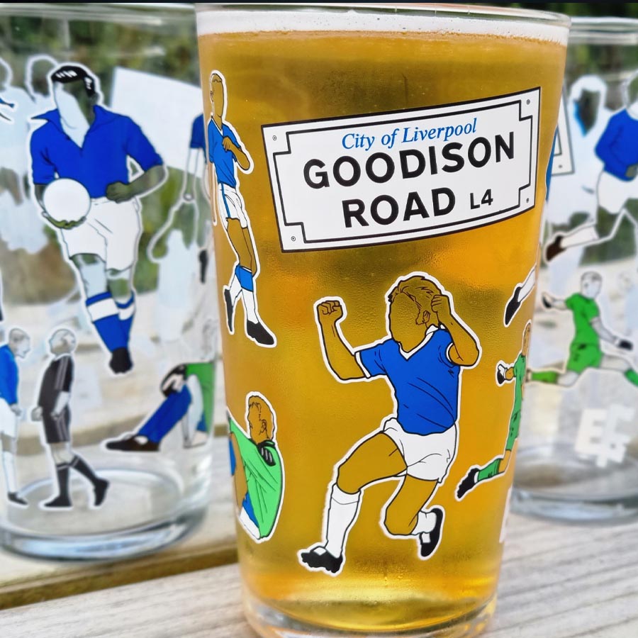
Everton Pint Glass
ORDER NOW

Support GOT
With A Subscription

The Holy Trinity Everton T-Shirt
Order Now!

Goodison Park Print
Order Now

Holy Trinity
Order Now

Legends of Goodison Park
Order Now!

Shop with Amazon
+ Support GrandOldTeam
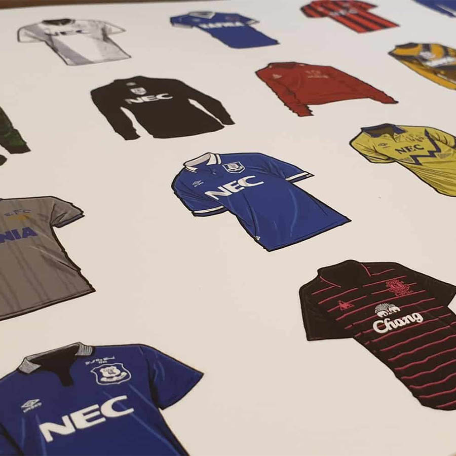
Everton Shirts
Order Now

Everton Mishmash Jigsaw
Order Now
Match Day Print
ORDER NOW

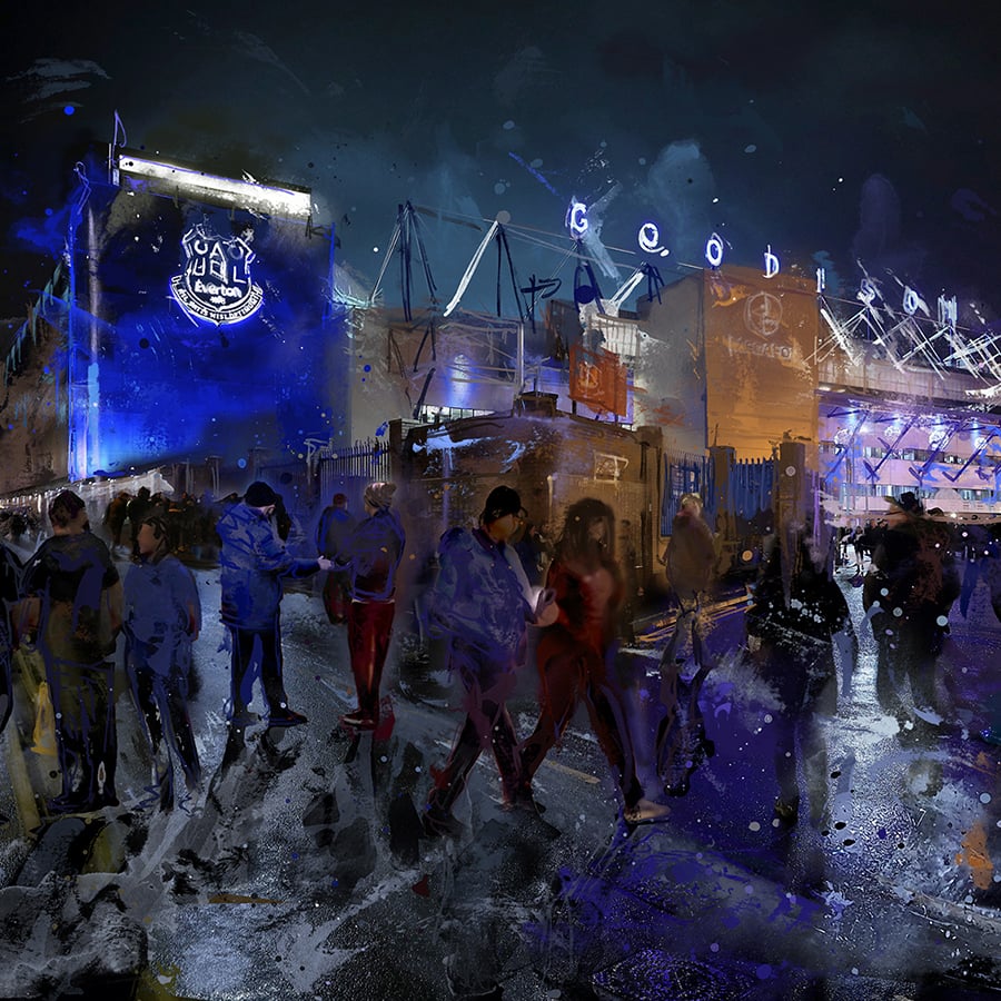
Goodison Park
ORDER NOW

Goodison Welcome
BUY NOW

Bramley Moore Everton T-Shirt
Order Now!