
SchoolOfScience
Player Valuation: £750k
Looking at the first badge makes you wonder what all this nonsense regarding the production difficulties of our old badge was all about, it looks much the same but ****ter

Ha, that's mine. I sent a couple of designs to the club I'd slaved over for hours - much better than that in my view. Absolute waste of time.


Looks like an owl.
Number 3.

Looks like an owl.

This was posted on here a while ago, and while it doesn't have the individual features people want, at least it looks like a badge a premier league club would have.

And the club didn't pay this guy £££ to come up with it...
Who in the blue hell is voting for 3???
Shield within a different shaped shield.... misshaped with weird gap between the two shields.
Everton written in bent font. Look at the way it's written.
It's awful. Like a 'Merseyside Blues' crest on a football computer game that couldn't get the rights to use the name & real crest of Everton

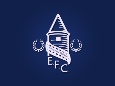
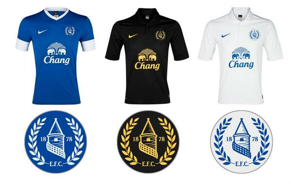
Bumping some fan-made designs from earlier in this thread..








Join the Everton conversation today.
Fewer ads, full access, completely free.


