TippEverton
Player Valuation: £35m
Something like this, sorry for low quality image.

I'd like that, maybe add nsno underneath, or the whole motto.
Have the crest all white on our home shirt, all blue on our away.
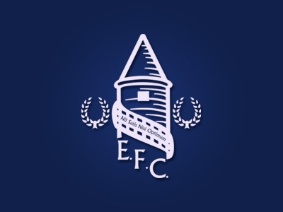
Something like this, sorry for low quality image.
Independent of the Club, Kenyon Fraser will collate all the suggestions, ideas and feedback from supporters. They will review, interpret and then create design options for the fanbase to vote on.
Don't worry about it. I had a few minutes to spare, so crest sorted.

Focus groups - A series of focus groups will be set up with representative supporter groups such as Supporters’ Clubs, Shareholders, the Fans’ Forum, the new Junior Fans’ Forum, the Everton Heritage Society and the Everton Former Players’ Foundation.
The same people who picked the last one then. Great.
The key thing here for me is this bit
Independent of the Club, Kenyon Fraser will collate all the suggestions, ideas and feedback from supporters. They will review, interpret and then create design options for the fanbase to vote on.
which is pretty much what happened last time isn't it? (Except now a lot more people will be voting than last time).
http://www.designweek.co.uk/news/everton-fc-unveils-new-crest/3036541.articlePremiership football club Everton has unveiled a new club crest, which has been designed by its in-house graphics team.
I'm with you mate, its not Roquefort science.
Amazing thread, with people saying things that are just not true.
No, only the Fans Forum were 'consulted'. All the other groups mentioned were not consulted at all. The Junior Everton Fans Forum didn't even exist last season.
No it is the complete opposite of what happened last time. The current badge we have a cheapo job designed in-house, not by an independent company.
http://www.designweek.co.uk/news/everton-fc-unveils-new-crest/3036541.article
The plans announced are great and fair. Everyone gets a say. Everyone gets a vote. Everyone can submit their own design.
Alan Myers has done a great job organising all of this. He deserves a lot of credit. I can't see how any of this could be portrayed as any kind of negative.
Oh well you see the old complicated badge with lots of small writing was fine in the days of black and white newspapers and SD TV. But now we have HDTV and retina displays so that means we need a simpler badge with less intricate design so it's easier to look at.honestly don't know what was up with the old one, a lot of fuss and nonsense this has caused
Wasn't someone outside involved? I thought I remembered some designer getting all defensive about the new one. But maybe it was just the in-house guy.No it is the complete opposite of what happened last time. The current badge we have a cheapo job designed in-house, not by an independent company.
Oh well you see the old complicated badge with lots of small writing was fine in the days of black and white newspapers and SD TV. But now we have HDTV and retina displays so that means we need a simpler badge with less intricate design so it's easier to look at.
If that doesn't make any sense to you whatsoever then welcome to the club.

Join the Everton conversation today.
Fewer ads, full access, completely free.