You are using an out of date browser. It may not display this or other websites correctly.
You should upgrade or use an alternative browser.
You should upgrade or use an alternative browser.
- Status
- Not open for further replies.
chrismpw
Player Valuation: £70m
The advertising on shirts is hideous. Who wants to be a billboard? It demeans the human that bears it and dilutes the pride of what the shirt represents. It is the fog horn of consumerism, detestable and ugly.
Never buy anything advertised is my mantra. If it were any good it would sell on reputation. If enough people realised this it would stop working and we could rid our environment of this visual litter.
That is all.
Never buy anything advertised is my mantra. If it were any good it would sell on reputation. If enough people realised this it would stop working and we could rid our environment of this visual litter.
That is all.
summerisle
The rain, it raineth every day
I take it you haven't got a GOT mug then.The advertising on shirts is hideous. Who wants to be a billboard? It demeans the human that bears it and dilutes the pride of what the shirt represents. It is the fog horn of consumerism, detestable and ugly.
Never buy anything advertised is my mantra. If it were any good it would sell on reputation. If enough people realised this it would stop working and we could rid our environment of this visual litter.
That is all.
")
chrismpw
Player Valuation: £70m
Shuddup!I take it you haven't got a GOT mug then.
Thetigerblue
Player Valuation: £6m
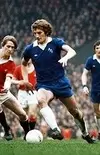
I don’t know how accurate the colour reproduction is, but the 1969-70 Royal Blue is my absolute favourite, both colour and overall design (and the similar blue in late 70s shirts). The ‘blue’ in shirts seems to have wandered all over the place in the last few decades.

Attachments
Thetigerblue
Player Valuation: £6m
PI don’t know how accurate the colour reproduction is, but the 1969-70 Royal Blue is my absolute favourite, both colour and overall design (and the similar blue in late 70s shirts). The ‘blue’ in shirts seems to have wandered all over the place in the last few decades. View attachment 83562
I don’t know how accurate the colour reproduction is, but the 1969-70 Royal Blue is my absolute favourite, both colour and overall design (and the similar blue in late 70s shirts). The ‘blue’ in shirts seems to have wandered all over the place in the last few decades. View attachment 83562
Different colored pyjama tops as footie tops were used when I was a ladSkins v shirts was when things were at their best .
Especially womens football

You are a visionary.The advertising on shirts is hideous. Who wants to be a billboard? It demeans the human that bears it and dilutes the pride of what the shirt represents. It is the fog horn of consumerism, detestable and ugly.
Never buy anything advertised is my mantra. If it were any good it would sell on reputation. If enough people realised this it would stop working and we could rid our environment of this visual litter.
That is all.
BluePeadar
Carlow Ancelotti
thats nothing! When I were a lad...........
You were a lad? A lad...Luxury
No childhood for me. I were born a 27 year old man with 3 kids and a job down mines
firefighterblue
Player Valuation: £20m
LuxuryYou were a lad? A lad...Luxury
No childhood for me. I were born a 27 year old man with 3 kids and a job down mines
Saint Domingo
Player Valuation: £90m
Everton’s shirts are particularly bad. I don’t know why we try our best to produce training tips, inside out kits, Wigan kits, or something that looks like a rugby league kit. I hate to say it but that lot over the park have turned out some decent kits recently under New Balance. Our Angry Birds logo is far too big and we can never seem to resist a stupid collar or pattern or bit of neon on the sleeve. Wouldn’t be hard to create a really classy looking royal blue Everton kit but it seems to be beyond Umbro these days.
The problem is the need to produce a new shirt every season. There are only so many versions of blue and white you can produce.
Same for every club really.
Except Watford. They should never have done away with yellow shirts and red shorts
Same for every club really.
Except Watford. They should never have done away with yellow shirts and red shorts
BluePeadar
Carlow Ancelotti
The problem is the need to produce a new shirt every season. There are only so many versions of blue and white you can produce.
Same for every club really.
Except Watford. They should never have done away with yellow shirts and red shorts
Ah we have had a few beauties over the years , it depends on the maker and the deal I reckon. Midnineties and early 00’s if we had the same supplier as Chelsea it would be same jersey identical except crest abd sponsor. I miss the days of getting excited over the fade or the in print design , subtle additions. You get good ones and bad ones . Just like lawnmowers and kebabs
Cameron Manning
Player Valuation: £35m
It doesn’t make any difference to Death he’s colour blind.What colour is it.
- Status
- Not open for further replies.
Similar Threads
Welcome
Join the Everton conversation today.
Fewer ads, full access, completely free.