2022/2023 Kit Release

Status
Not open for further replies.
If I'm not mistaken, part of our heritage was having no badge because we shouldn't need a badge to tell people who we are.

Then for years our heritage consisted of 'EFC' and that's it.
now our heritage has a shield, three different images, a date, our motto and our name.

I like the minimalist approach (adding EFC might be an idea)
I don't think it's an attempt to Water down our heritage, if anything it cleans it up and focuses it.
But it looks like a crayon.
 
in the 77-78 season they just had EFC on their kits. There was umbro symbols all down the sleeves and on the chest but still the club just used 'EFC'.
There was nothing on the shirt in 72, when other clubs all had badges. We were everton, everyone knew that.

I agree that the running of the club is terrible at times but some unique branding isn't a sign of incompetence.
Not just the kit is it?

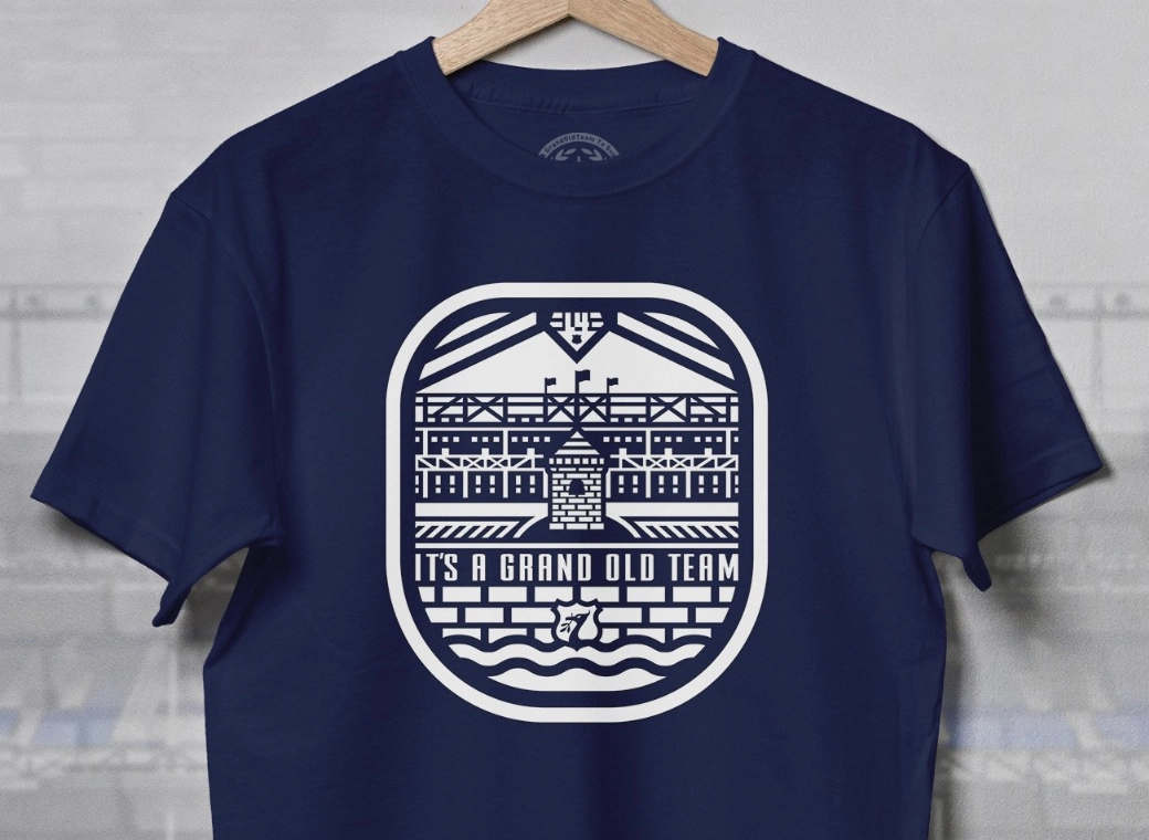
This *Tower* re-branding is not without deeper meaning.

Anyone who thinks this is all benign are not reading the room.
 
1_xW5HFbu33tkzQ2zbHMp3BA.jpg
Flat logo design it's called, most companies have shifted towards it in recent years.
 

...a return to sanity then on the choice of colour.

But that Tower motif instead of the badge is a nasty little corporate trick smuggled in on an a third kit - they're piloting that and if we're not too careful the suits will be replacing the traditional badge on the home kit with it.

These people are determined to water down our heritage. Be vigilant.

If that’s the actual 3rd kit, without a real badge, they can shove it! It looks daft, some say it looks like a crayon, others say it looks somewhat phallic either way, it’s not Everton.
Such a shame because the rest of the kit looks good.
 

If that’s the actual 3rd kit, without a real badge, they can shove it! It looks daft, some say it looks like a crayon, others say it looks somewhat phallic either way, it’s not Everton.
Such a shame because the rest of the kit looks good.
Lot of clubs doing it, having an "alt" representation of the crest. Considering all the kits are marketed with the tower as the central theme I think its OK. Works fine.
 
If that’s the actual 3rd kit, without a real badge, they can shove it! It looks daft, some say it looks like a crayon, others say it looks somewhat phallic either way, it’s not Everton.
Such a shame because the rest of the kit looks good.
It's a nothing brand. It doesn't tell anyone outside the club what or who we are...and I dare say many Evertonians will look at it sideways as being an unintelligible reference to Rupert's Tower.

How do these corporate heads get away with nonsense like that?

They run it past a decision maker who in this case has gone for their alarming elimination of references to our successful history...because that history embarrasses them and their present failures.
Triggered ??
 

Potentially unpopular opinion time here - but having seen the kits multiple times both on tele and in person, I actually prefer the look of the Stake logo over the Cazoo one. Think the Stake logo is just a bit more unassuming and, dare I say, elegant compared to the Cazoo one ?‍♂️ it frames the front of the shirts a bit better IMO.

Also - this seasons home shirt is deffo better than lasts. I personally wasn't a big fan of the yellow in the cuffs & collar - just stick to simple blue & white always.
 
Lot of clubs doing it, having an "alt" representation of the crest. Considering all the kits are marketed with the tower as the central theme I think its OK. Works fine.

I just can’t agree that is “works fine” on any level. If it was a newer version of the 83 to 91 style crest with the tower, laurel wreaths and EFC on the kit, then I would probably love it. But that version of the tower, on its own is meaningless.
Years ago we added “Everton” in massive letters to the badge so that a global audience knew who we were. Now we are doing this?! It makes no sense.
It’s now a Stake.com kit, made by Hummel with no actual reference to Everton.
Apart from the Everton players that'll be wearing it ?

Moan moan moan!
 
Apart from the Everton players that'll be wearing it ?

Moan moan moan!

Are you actually happy for that Tower to become our new "badge" on our shirts? Because I am sure it is very cheap to produce, much cheaper than the badge on the other shirts and if a lot of people buy the yellow kit, the club and Hummel may think its a good idea to have that as the badge for all kits next season. I just hope the yellow one doesn't sell well and the club doesn't try and push this badge design.
 
Are you actually happy for that Tower to become our new "badge" on our shirts? Because I am sure it is very cheap to produce, much cheaper than the badge on the other shirts and if a lot of people buy the yellow kit, the club and Hummel may think its a good idea to have that as the badge for all kits next season. I just hope the yellow one doesn't sell well and the club doesn't try and push this badge design.

Not at all bothered lad ! Paying my gas and leccy keeps me up at night, not the Everton badge!
 

Status
Not open for further replies.
Top