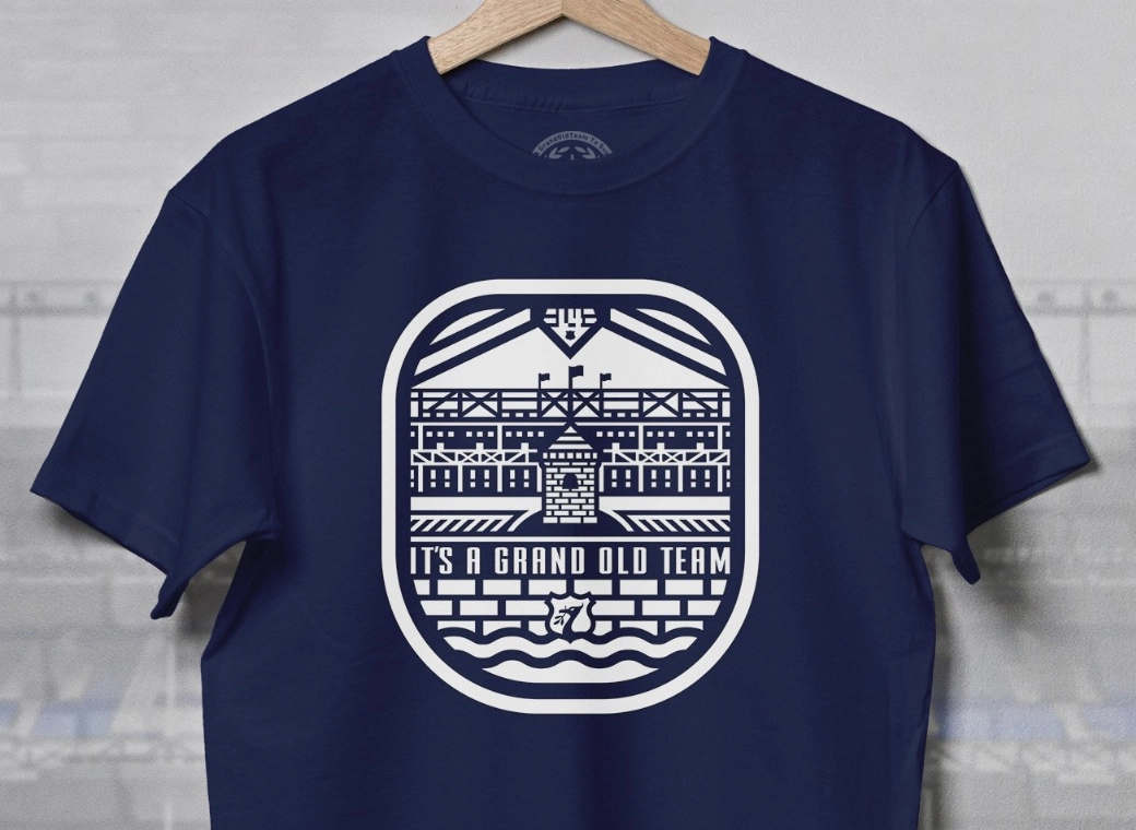
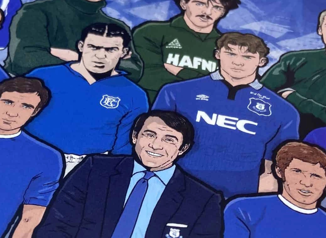
It aint us....Its crap.
You are using an out of date browser. It may not display this or other websites correctly.
You should upgrade or use an alternative browser.
You should upgrade or use an alternative browser.
- Status
- Not open for further replies.
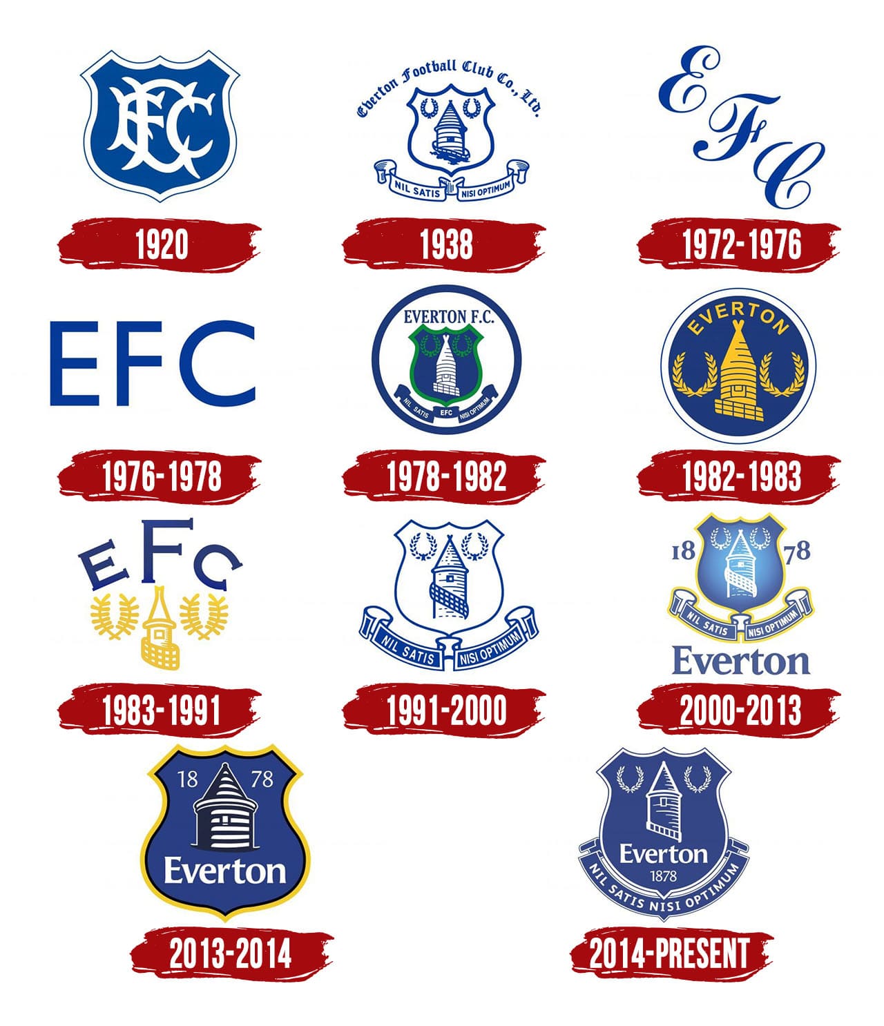
So which one do you think is us then?It aint us....Its crap.
Personally if I was asked to rank the ones below, not one of my top 3 would contain that shield shape.
Inchy226
Player Valuation: £950k
The way this Summer has gone, it may as well be...So which one do you think is us then?
Personally if I was asked to rank the ones below, not one of my top 3 would contain that shield shape.
That pointy whatchamacallit isn't an evolution, it's abstract art for aimed at clueless hipsters like you.
@SassyDavek
The age old question, does size matter?
Dunno why it's ever been a question, TBH...it's been answered a billion times.
This is just Chaff flung out by the cloob to confuse your aim at the real issues.
The real key question - (forget all this Branding nonsense, let Chuck Connors look after that.)
Is it available to play up front Vs Villa?
All other immediate considerations...white whale logos, pointy rectangle logos, FTP, etc, etc, pale in to insignicance way down the list of things to worry about.
We Still haven't got a 'Kin Striker
We haven't replaced Richo, nevermind Lukaku
Top left & bottom right for me.So which one do you think is us then?
Personally if I was asked to rank the ones below, not one of my top 3 would contain that shield shape.
nonstripdzebra
Player Valuation: £1.5m
As I work in GD I was curious breaking down the Inspiration boards/drafts the design team shared.
Reiterating but I personally find the new design a bit out of date despite trying to be contemporary, and ultimately nondescript. Can understand the impulse to come up with something a little more broadly usable, but personally the newest version is ultimately forgettable and reads like a bad app icon. In the clubs canon I look at the past shirt lettering, and or the late 70s tower and think there could have been some reinvention of that era for the same goal, adding a little more specificity than the vector shape.
But from the mood boards they came up with I think if the club are debating a subsequent redesign I would suggests these details to expound upon.

This is at least more descriptive. I think they did a nice job on the font design (in how it plays with the tower in the negative space of the numbers and letters). Enjoy even more the 2nd font. In this case I think even the numbers help reflect a uniqueness of the brand. I don't love this but it has more merit or consideration than simply the vector tower.

Saw this on a draft board, I think this has more potential for something unique. Maybe a badge shape is the outline. I think this has more call back to history, a little more resemblance to the lock up, while also being a little more unique. Would need to be worked more but its interesting.

I think this is interesting and more in a contemporary design trend then the 3rd kit badge. Gradient panels and or a 3d version of the lock up like this (obviously round) could be something to play with.

This isnt the badge, but just broadly speaking the strongest concept I saw. Has a contemporary cleanliness, but also a nice tie to history with the badge silhouette and more vintage font that seems very Everton, with overlap to the badge typeface. Looks more textured and could see how this could be used in conjunction with historic images and designs etc. They would be wise to push more in this direction.
Reiterating but I personally find the new design a bit out of date despite trying to be contemporary, and ultimately nondescript. Can understand the impulse to come up with something a little more broadly usable, but personally the newest version is ultimately forgettable and reads like a bad app icon. In the clubs canon I look at the past shirt lettering, and or the late 70s tower and think there could have been some reinvention of that era for the same goal, adding a little more specificity than the vector shape.
But from the mood boards they came up with I think if the club are debating a subsequent redesign I would suggests these details to expound upon.
This is at least more descriptive. I think they did a nice job on the font design (in how it plays with the tower in the negative space of the numbers and letters). Enjoy even more the 2nd font. In this case I think even the numbers help reflect a uniqueness of the brand. I don't love this but it has more merit or consideration than simply the vector tower.
Saw this on a draft board, I think this has more potential for something unique. Maybe a badge shape is the outline. I think this has more call back to history, a little more resemblance to the lock up, while also being a little more unique. Would need to be worked more but its interesting.
I think this is interesting and more in a contemporary design trend then the 3rd kit badge. Gradient panels and or a 3d version of the lock up like this (obviously round) could be something to play with.
This isnt the badge, but just broadly speaking the strongest concept I saw. Has a contemporary cleanliness, but also a nice tie to history with the badge silhouette and more vintage font that seems very Everton, with overlap to the badge typeface. Looks more textured and could see how this could be used in conjunction with historic images and designs etc. They would be wise to push more in this direction.
Last edited:
DO give up the day job mate.As I work in GD I was curious breaking down the Inspiration boards/drafts the design team shared.
davek
Player Valuation: £150m
Brilliant.
OneTrueLegend
Player Valuation: £35m
For me it should just be something like this on the shirts, just the tower and laurel wreaths, the same as they appear on the main badge. If you look back at the old badges they all have the tower and the laurel wreaths from the 1930’s onwards (other than 13/14) and to me that’s what is unique to us. I feel like if you show any premier league fan that image above, they would recognise it as Everton.
Acrobat
Player Valuation: £10m
So which one do you think is us then?
Personally if I was asked to rank the ones below, not one of my top 3 would contain that shield shape.
Every crest since 2000 is crap. I HATE the word EVERTON on the crest. Sorry, its just not needed. All the others I love, and would gladly see on the kit any time again. You can all hate me for saying this, but I love Liverpool's shirt crest, simple and effective. I wish we would go back to the 80's one!
As for the 'tower' on our yellow kit, I like it. Its different and I see what they are trying to do, but it could be SO much better.
- Status
- Not open for further replies.

