
Install the app
How to install the app on iOS
Follow along with the video below to see how to install our site as a web app on your home screen.
Note: this_feature_currently_requires_accessing_site_using_safari
You are using an out of date browser. It may not display this or other websites correctly.
You should upgrade or use an alternative browser.
You should upgrade or use an alternative browser.
- Status
- Not open for further replies.
Coach
Player Valuation: £30m
We spend a fortune changing the badge so we can 'strengthen' the brand and then produce this steaming pile of [Poor language removed] where the badge is barely visible and the predominant colour is white. Nice one Everton's marketing department.
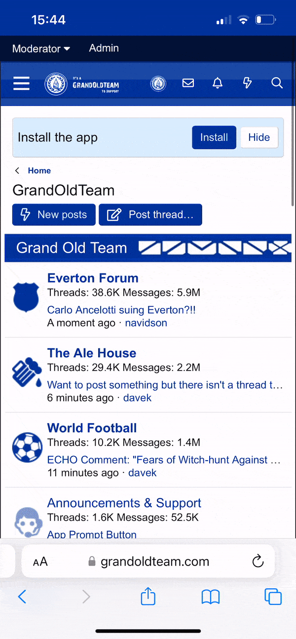
Why is the header section 800px wide and the middle section unlimited?
The horizontal scrolling means that you cannot see all of the submenu options unless you scroll. Parts of the site are effectively hidden. Bizzare.
Why is the header section 800px wide and the middle section unlimited?
The horizontal scrolling means that you cannot see all of the submenu options unless you scroll. Parts of the site are effectively hidden. Bizzare.
This sort of sponsor list with completely random spacings is my favourite bit.

4737carlin
Player Valuation: £90m
Is it hosted by GeoCities?
Too busy, needs more clicks than is necessary to get to what you want, there was nothing wrong with that last one that needed a complete overhaul
Too busy, needs more clicks than is necessary to get to what you want, there was nothing wrong with that last one that needed a complete overhaul
Arteta2391
Player Valuation: £30m
When will Everton get anything done right?
BOYCOTTED
The OS and all official social media - anything official.
Im total pirate.
The OS and all official social media - anything official.
Im total pirate.
canucklehead
Player Valuation: £500k
It has a tweetdeck feel to it which I like, but I feel like the execution falls a bit flat.
DualityNSNO
How much for the pair?
As if the results weren't horrible enough, now we get this.
Actually makes me want to vomit.
Actually makes me want to vomit.
StatesideBlue3
Player Valuation: £1m
It's boss on my phone which looks very different from the screenshots here.
Springhettios
Player Valuation: £750k
It is pretty awful. The different windows that have scrolling bars is not a good idea. It is definitely very busy and I like the updated look but too much going on.
- Status
- Not open for further replies.

Blue Skies
ORDER NOW

Everton Mishmash
Check It Out!
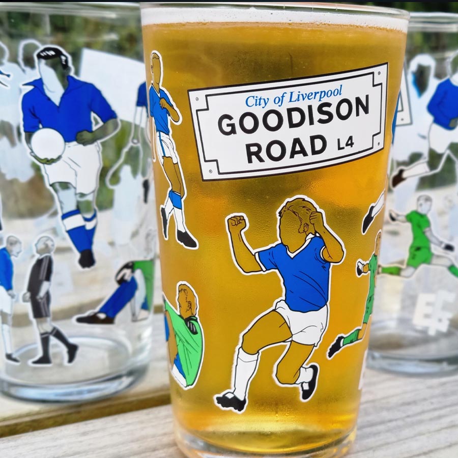
Everton Pint Glass
ORDER NOW

Support GOT
With A Subscription

The Holy Trinity Everton T-Shirt
Order Now!

Goodison Park Print
Order Now

Holy Trinity
Order Now

Legends of Goodison Park
Order Now!

Shop with Amazon
+ Support GrandOldTeam
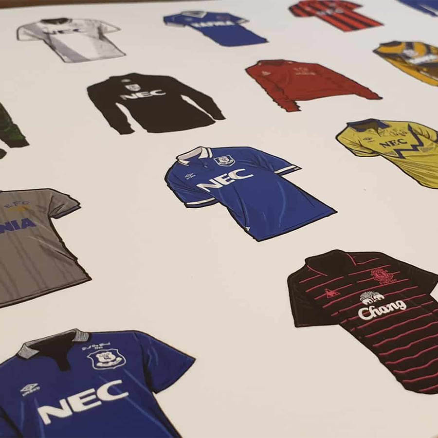
Everton Shirts
Order Now

Everton Mishmash Jigsaw
Order Now
Match Day Print
ORDER NOW

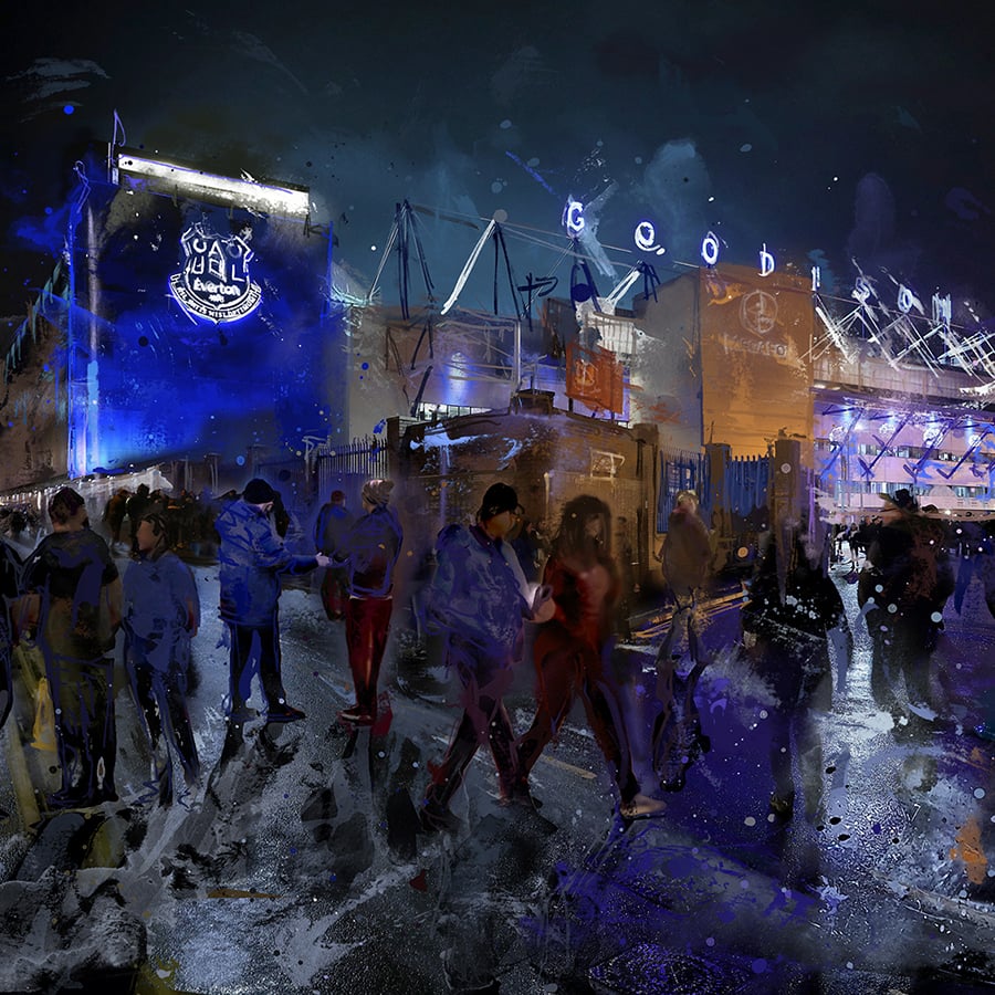
Goodison Park
ORDER NOW

Goodison Welcome
BUY NOW

Bramley Moore Everton T-Shirt
Order Now!