TimHowardsBeardJuice
Player Valuation: £35m
Is there now a ban on alcohol sponsors? Chang was the sponsor when I first became a Blue, and they seemed iconic, as these things go. I look around and don't see any others.
That's fabulous, hope that's real

Is there now a ban on alcohol sponsors? Chang was the sponsor when I first became a Blue, and they seemed iconic, as these things go. I look around and don't see any others.
Interesting badge. Kit looks nice but as ever that sponsor ruins it
That’s a shocker. Why’s the sponsor outline white? The badge is crap aswell.
I’m usually a fan of a yellow one but that looks like a semi-decent training top rather than a match jersey.
Exactly.Big fan of changing the badge! I've never liked the modern crest. My issue with the modern crest - especially since 2000 onwards, is there's just to much on there. It's like whoever designed it felt simply the tower, the laurels and our motto weren't enough. It also had to say Everton and 1878.... it's like they had a list of things they wanted to squeeze into it. We are instantly identifiable by the tower... we don't need our name in New Times Roman underneath.
For me the best Crest was the 83-91 one and I'd love to see us return to something simpler like this.
Yeah, our badge is cack. Marginally better than the fat badge it replaced, but nowhere near good enough.Big fan of changing the badge! I've never liked the modern crest. My issue with the modern crest - especially since 2000 onwards, is there's just to much on there. It's like whoever designed it felt simply the tower, the laurels and our motto weren't enough. It also had to say Everton and 1878.... it's like they had a list of things they wanted to squeeze into it. We are instantly identifiable by the tower... we don't need our name in New Times Roman underneath.
For me the best Crest was the 83-91 one and I'd love to see us return to something simpler like this.
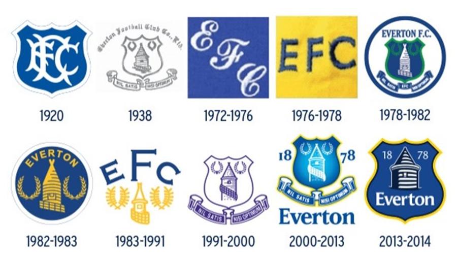
Liverpool still use their badge - but on the shirts it's the bird because and that's all they need.Exactly.
Liverpool and Spurs have done it with the simplified logo on their shirts and it looks way better. Liverpools actual crest became a bit of farce over the past 20 years. They'll be adding a Big Stand feature to it next.
I've always liked the idea of following the lead of Spurs and Liverpool on the shirt and going with the Tower, Laurels and E.F.C. above like in the mid-80s.
I like the idea of this new one even tough its a bit 'clinical.
Regarding the kit. its okay. I think we should always have a yellow or amber option, and then experiment with the third kit.
I would like us to re-introduce the 1920's badge for our final season at Goodisons and then go into BMD completely rebranded. A modern take on the 83 crest without the EFC would be perfect. And at the risk of sounding negative remove the moto until we earn it again.Yeah, our badge is cack. Marginally better than the fat badge it replaced, but nowhere near good enough.
Personally, I'm a fan of the 83 - 91 crest. Modernise that a bit, maybe even remove the "EFC" and I think you've got something simple and effective.
I quite like the abstract version the club are using in their branding, but I'm not sure it should be on that shirt. It's a bit too simple.
Join the Everton conversation today.
Fewer ads, full access, completely free.