Everton branding

Status
Not open for further replies.
Yeah there did used to be more of an "art" to it I reckon.

Stuff is far to pretentious and in your face these days.

This latest logo thing is basically "We need a badge that is easier to print and less fiddly to use." That's it, that's the remit, all the other stuff is just guff.

Personally i don't hate it, I have seen some people with the new logo in a lapel pin and I think it looks really nice and understated, I do wish that they put the laurels in though, even a modern take on them too.
It’s just the garrulous unnecessary language they use to come up with a statement to somehow attach meaning to an inanimate object.

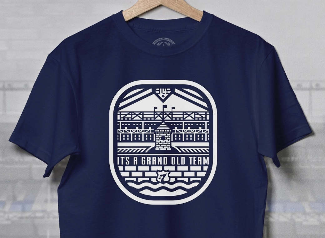
I quite like this badge as a one off l, I see it as a silhouette and I think it’s a little different and quite cool really. I’m not going to buy the shirt though
 
Work 1878 and E.F.C. or Everton into it, would look a pretty good modern take on the badge
Yeah I reckon it could be good with EFC in the silhouette and 1878 underneath or something, might be a rebrand when bramley Moore finishes up
 
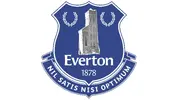
With the badge being changed to a tower on a third kit is today I wanted to share this with you, and ask your opinions.

Sorted ;)

View attachment Everton-Logo-2014-present.jpg
 

Attachments

  • Everton-Logo-2014-present.jpg
    873.2 KB · Views: 61
With the badge being changed to a tower on a third kit is today I wanted to share this with you, and ask your opinions.

I suppose it has a pared down simplicity
iirc, the first ever 'modern' logo / trade mark was a Bass red ?
Others are the convicts arrow on the suit and all MOD stuff
Pawnbrokers balls
Barbers pole
Inn signs
To name but a few

They've messed up most things in footy, why not the badge.
 
It’s just the garrulous unnecessary language they use to come up with a statement to somehow attach meaning to an inanimate object.

I quite like this badge as a one off l, I see it as a silhouette and I think it’s a little different and quite cool really. I’m not going to buy the shirt though
Me neither unless they start rebranding for the more "rugged and manly*" figure.

*Marketing speak for fatty.
 

It might all be guff, but I like the result. A simple, clear logo we can use in loads of different settings.

But it's not a replacement for the badge. It was a mistake to use it on the shirt, I think.
 
Pawnbrokers balls
Barbers pole
ooh-matron-kenneth-williams-carry-on-camping.gif
 

The fact the club themselves haven't put any of this info on the OS or Tweeted about it when the deal was signed or prior to the third kit launch etc shows you how they knew how people might react.

I get digital branding and the need for simpler forms within marketing. I also get the guff that goes with it all but this is quite hilarious.


It's a pointy rectangle. It's nothing ground breaking or owt.

Look at that exploded view. lol lol


Status
Not open for further replies.
Top