StDomingosGringo
Player Valuation: £10m
I also approve. Now I can read my club propaganda with a slightly darker edge to it")
Follow along with the video below to see how to install our site as a web app on your home screen.
Note: this_feature_currently_requires_accessing_site_using_safari
blackberries are wonderful things
) Anyway, I can now log into the site from work with no pop up warning. And it now saves my log in normally, like every other site does, so I don't have to log in each time I vist the site which was an absolute pain in the butt.Colour wise I love it, and its live now. But, unlike the old one, I can't lot into work unless its added to the white list by the Council's admin. Oh, yes, I can see that happening. May not be EFC's fault.
Got home, and I now get strange notices on my pc about unsafe sites. I like it, but sad I can no longer log into it from work.
Ghost will still be tutting and pfft'ing at the mundaneness/blandness/increativityness of it all.
can you just add 'ness' to anything ?
wankness? garbageness? titness? rippleffectihavebeatenyoutwiceness?
For a top quality site, check out my latest - Hard Days Night Hotel | Liverpool Beatles Boutique Hotel | Hotels Liverpool

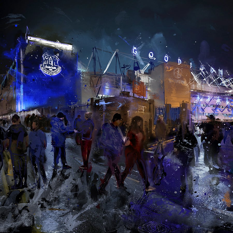
First impressions - it doesn't look that much different to previous site.
Don't really know where to look though, there's so much going on all over the page at the same time.
Kinda my thoughts about the new Kipper front page.
Of course their old page was so basic that any upgrade might have been considered "too much."
Agree somewhat. Although a lot of sites do this over information front page thing (actually most marketing material does it too) which is a bit of a turn off.
I'm all for simple, well laid out info, although without being too sterile/über cool/whatever you want to call it.
Though not naive enough to realise that the designers/developers are probably under instructions from powers that be to fit all this content in to appease sponsors/advertising etc, so don't want to lay into it too much!
See Ghosts site has some nice creativity - just a bit light on content!!!