-
 Turn On Christmas Radio
Bah humbug - to turn off the snow, visit your preferences and select a style that isn't Christmas.
You are using an out of date browser. It may not display this or other websites correctly.
You should upgrade or use an alternative browser.
You should upgrade or use an alternative browser.
- Status
- Not open for further replies.
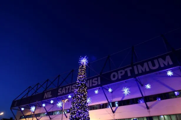
Just getting the "nil satis nisi optimum" slogan back on the badge was a must, although we have had our best season in a long time once it had been removed! Which is pretty ...... Up!
It's too much, which is why it was removed. Look at the vast, vast majority of crests for the most commercially successful and well-known teams. They have their name and the artwork. Some will have the date of the club's formation, but will have initials instead (i.e. EFC).
I had hoped that they'd redesign the badge to something much more streamlined and stitched the motto on the side of every collar. That would have looked classy. The current crest isn't too bad. If they moved the motto to the corner, everything would be so much better.
OneTrueLegend
Player Valuation: £35m

Please tell me this is some sort of Photoshop joke? This is really lower league looking [Poor language removed]!
KevMirallas
Player Valuation: £35m
They're going to fix it FFS.
pablo 1878
Player Valuation: £8m
For all the pussies whinging about it needing a lick of paint
@efc_danalston: New crest transition underway. Judge stadium usage on completion. Finch Farm looks class. Digital/social switch in coming days.
Basically, the job isn't finished so pipe down
@efc_danalston: New crest transition underway. Judge stadium usage on completion. Finch Farm looks class. Digital/social switch in coming days.
Basically, the job isn't finished so pipe down
iPauloxD
Player Valuation: £950k
Is it just me that dislikes the new crest?
Considering most people voted for it, Yup
radiostar
Player Valuation: £20m
Nope. Can't stand it myself.Is it just me that dislikes the new crest?
dbignall85
Player Valuation: £2.5m
I absolutely love the new crest.
Fearthainn
Player Valuation: £30m
lol I know it will be fixed, but it would be typical Everton to [Poor language removed] that one up.
- Status
- Not open for further replies.
Shop

Everton Pint Glass
Our exclusive Everton pint glasses are a true collector’s item that pays homage to Goodison Park through iconic players who have graced the pitch over different generations.

Everton Mishmash
The history of Everton FC in one image! “The best Everton thing I’ve ever got!”

Goodison Park - Blue Skies
A truly, wonderful piece which brings memories of visits to Goodison Park alive.

Goodison Park - Under The Lights
This print wonderfully encapsulates the magic of the ‘Goodison Under The Lights’.

Goodison Park - Sunset
A wonderful, A3 aerial print of Goodison Park.

Everton Jigsaw
A special, limited edition 1,000 piece jigsaw of the popular Everton Mishmash – The History Of Everton FC In One Image!

Goodison Gang T-Shirt
Introducing our Goodison Gang Everton T-Shirt.

Grand Old Team T-Shirt
Our newest Everton T-Shirt.

Legends of Goodison Park
Everton champions, legends, and long-time servants assembled together in one squad photo!