Nashtbs
Player Valuation: £2.5m
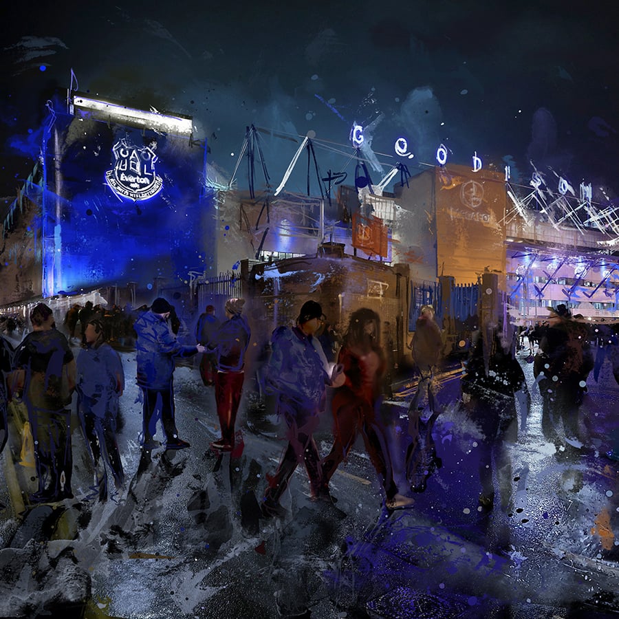
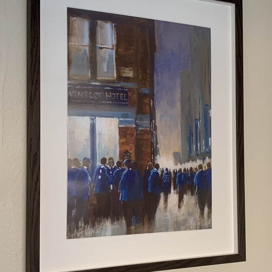
So my girlfriend wrote her dissertation on football marketing and how rebranding can effect clubs. Our club official was incredibly helpful (moreso than her own club: Hull City). I'm not sure if any of this is new groud or how much of this was known before but he confirmed the drop in sales because of the badge. Take a read of the Everton part if you're interested.
If this needs merging with a badge thread, feel free to do so.
She also wants me to pass on her thanks for all the Evertonians help as we were a hugely significant contributer to her research. Thanks blues!
Full dissertation here : http://www.scribd.com/doc/271253160/Marketing-in-Football-A-business-versus-a-culture
If this needs merging with a badge thread, feel free to do so.
She also wants me to pass on her thanks for all the Evertonians help as we were a hugely significant contributer to her research. Thanks blues!
One club that have changed their Club badge in the last few years are Everton FC. The club decided that a new badge was needed in order to maintain consistency throughout national and international media on print and television as well as making a suitable reproduction for the digital era
The new badge was unveiled prior to the 2013/2014 football season with that season’s
kit already being in production with the updated badge. Figure 1 shows the previous badge to the reproduction which shows a noticeable difference with the change in the design of the tower, the removal of the scroll and wreaths. The reproduction was suitable for digital use as well as looking a lot smarter and tidier. Despite this, many fans did not like the badge and over 25,000 signed a petition against the badge change. Speaking to a club representative at Everton, the reasons behind the badge change were mainly to simplify a complicated badge that was often poorly reproduced. In an interview the club representative admitted that the process in which the club went about changing the badge didn’t work, in part due to not fully involving fans in theprocess. In my own primary research it was discovered that Everton fans have high values of traditions, keeping the history of the club alive and the importance of name, badge and heritage. The wreaths and the scroll underneath the badge were both deemed as being traditional and important features of the badge. As the new proposed design had neither of these, fans took a negative stance to the badge which may have also contributed to a drop in kit sales during the 2013/2014 season, although the badge was not the only factor in this- the kit was similar to that of the previous season.
Knowing that the opinions of supporters and shareholders were important, Everton then rethought the idea of the badge change and gave everyone related to the club an opportunity to voice their own opinions. The club representative went on to explain that “around 300,000 surveys of 10-20 questions were sent out to Evertonians about what areas were important to them. We collated all of the feedback, held focus groups with fans, directors and shareholders to gather all opinions which we then forwarded to an external design company who came up with three designs which all had elements of the opinions of the Evertonians”.
Figure 2 shows the three designs that were developed from the feedback given which was then put up to the test of the supporters who were given the chance to vote for the favourite of the three in which badge number one was voted favourite by 78% of supporters and the one that was produced and used in the latest 2014/2015 Barclays Premier League season. When asked whether taking the fans thoughts into account was the best way to go about the changes, Everton’s club representative went on to say “absolutely, fans arecrucial to the process; they are tattooed, children have bedrooms full of our merchandise and people have badges on their gates outside of their houses. Engagement is key and done properly has showed that fans are willing to adapt but just wanted to be in the know with changes and be able to have their voice heard. The new badge is not as simple as the 2013/2014 edition however it is what the fans wanted and it is still replicable and digitally fit”
Full dissertation here : http://www.scribd.com/doc/271253160/Marketing-in-Football-A-business-versus-a-culture
")