The board and weaponised branding?

Is the club weaponising branding against the fans?

  • Yes, the board do not care about our history and are weaponising branding against the fans

    Votes: 8 7.3%
  • Yes, but it's not deliberate it's just incompetence

    Votes: 24 22.0%
  • Maybe, but nothing stands still

    Votes: 9 8.3%
  • No, the badge has always evolved

    Votes: 31 28.4%
  • No, I like the new badge and the club's bold commitment to change

    Votes: 16 14.7%
  • I think the badge should be changed to cheese on toast

    Votes: 21 19.3%

  • Total voters
    109
Status
Not open for further replies.
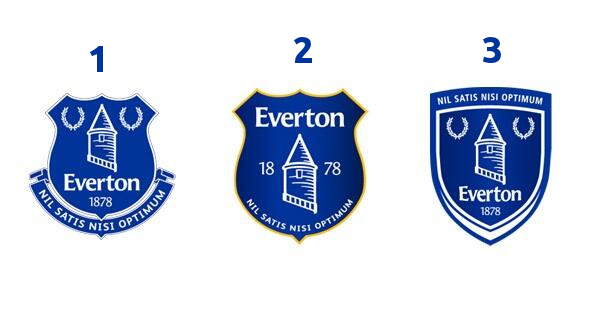
As someone mentioned earlier I think the tower symbol is more likely to be used for street wear or casual clothing, t shirts, shirts etc. I’d rather have that, more subtle and an alternative to other designer brands.
For the kit it needs to be the full badge - no reason not to really.
 
The removal of the Latin was a reaction to the populism of Brexit and the fear of anything non English.

The board trying to capture the national zeitgeist.
That the biggest pile of …. Ever written on this forum

Everton havnt been living up to the Latin for years to the point it’s now a joke. It’s embarrassing. Same as the The People Club
 
Love the badge, want no changes.

It's clear they've been pushing this for awhile, it's on the socks and back of the neck of the home kit, they use it in the negative space of numbers on the back of cup kits, you see it on the Everton app when you log in. Maybe they're going to feature it promintenlty as a design element in the new park. I'm ok with the concept* of a secondary mark but I really, really don't like not having the badge on the kit. It's one of the best badges anywhere IMO.

*Like the concept. Execution not so much. Looks like a condom,.
The outing your newels old boy as angular and pointy is very on brand with brave new Everton.
 
I love it, it’s a post modernism expression of the direction of travel for our great club, the new badge characterises our self-referentiality, epistemological relativism, moral relativism, pluralism, irony, irreverence, and eclecticism; it rejects the "universal validity" of binary oppositions, stable identity, hierarchy, and categorisation.
Anyone who disagrees is a bad luddite whopper who probably claps Kenwright.
 

If you read why Everton last changed the logo, it was to get the word Everton within the main body of the crest. They also shared their reasoning for that.

[Edit] In their apology;

A reminder of what we were trying to achieve

We remain firm in the belief that our Crest should be modernised – not a unique or unprecedented situation and one we know our fans would accept and embrace. Effective logos are simple and streamlined. Simplicity achieves stand-out recognition. This was our starting point for our new Crest.

Our solution, in a globalised, technology-led world – was to present one word, loudly and clearly – EVERTON


It's why all three options after this, had to have the word Everton within the crest;

BUy7wr2CMAAR63v.png
I'm a big fan of 3.
 

Status
Not open for further replies.
Top