You are using an out of date browser. It may not display this or other websites correctly.
You should upgrade or use an alternative browser.
You should upgrade or use an alternative browser.
- Status
- Not open for further replies.
I'll be honest, I haven't expected anyone to go "they got a great logo, yo!" since about 1990. As for the rest, its true. I mean its not as if anyones been looking for the club to get a more effective commercial and marketing strategy going, is it? Multiple logos, the way forward, we'll leave "going all America" to the Uniteds Liverpools and Spurs of the premiership, can't see a flaw there.
Hey, it was Bill who said that you can't fool an Evertonian. This whole abortion has been an unnecessary distraction...go manufacture consent elsewhere.
They're one of the main Houses (families).
"Winter is coming." b)
We want the Lannisters to buy us, they are minted.
We want the Lannisters to buy us, they are minted.
According to this we are The Night's Watch...
http://www.grantland.com/blog/the-t...f-thrones-to-english-premier-league-converter
According to this we are The Night's Watch...
http://www.grantland.com/blog/the-t...f-thrones-to-english-premier-league-converter
I would have had Liverpool as Crasters keep.
sanctioned
Player Valuation: £6m
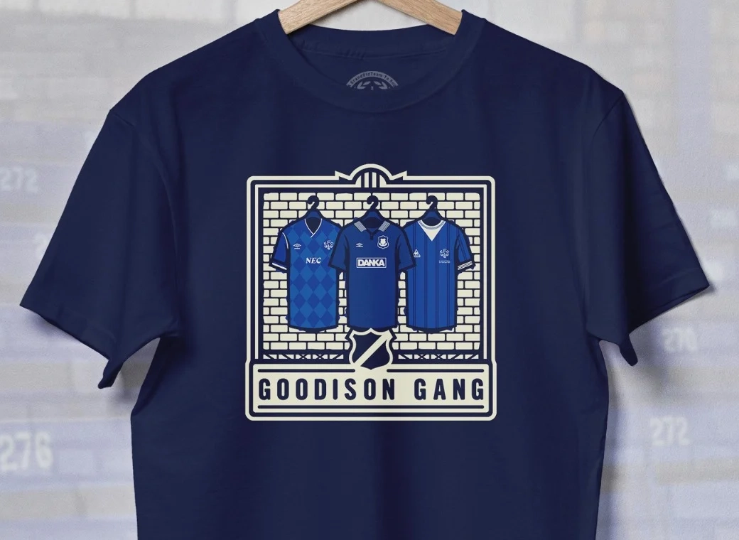
Been working on this for a couple of days:

I see you are on reddit

Nice crests by the way, wouldn't mind that at all.
Though, would be nice to have NSNO on the shirt somewhere such as the collar
Bluesnapper
Player Valuation: £10m
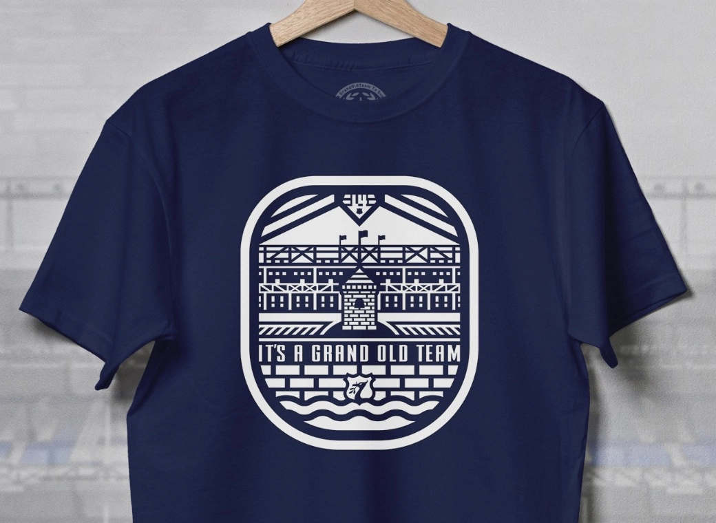
Been working on this for a couple of days:

Big part of the problem was the tower looking like a beehive, bin that design and start again.
BoysInBlue
Player Valuation: £50m
I see, so they are hired by the club but not employed by them. Oh, and they are independent.
ROFL.
You can be independent and be hired by someone to do a specific job you know.
In any line of work - companies bring in 'independent specialists' hired for a specific contract, 6 months, whatever.
We're just arguing about semantics now.
My point was the people they've got in have outside real world experience of doing stuff like this, unlike an 'in-house team' that normally just work on stuff like the matchday programme and magazine.
D
Deleted member 28206
Guest
Been working on this for a couple of days:

Nice to see you working on this mate, but i have to be honest - if critical, i dont like these, purely cos of that god awful concept of the Beehive looking Ruperts Tower. If you can stay 'true' to that image, you will be on to a winner - you can grow it with your own ideas like, but just swerve that dreadful fat looking beehive.
This is the evolution of the Tower in print

Like most things, its gotten fatter with age, this doesn't need to happen - the argument from the club is that it ' doesnt translate well in HD, print and other media '.
Thats complete bollox. A poor excuse to manage a perfectly good historical emblem, i don't doubt they had a reason to change it and fatten it out, but it looks god awful.
eigh
Player Valuation: £225k
Azza
Player Valuation: £80m
- Status
- Not open for further replies.


