BoysInBlue
Player Valuation: £50m
Mate post in the other thread....")
Should combine the two threads and keep this poll.
Follow along with the video below to see how to install our site as a web app on your home screen.
Note: this_feature_currently_requires_accessing_site_using_safari
Mate post in the other thread....
0.63% of Evertonians like the new badge.
6 people are morons.
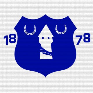
Everton fans hit out over new club crest after Latin motto removed
PUBLISHED: 01:53, 26 May 2013 | UPDATED: 01:53, 26 May 2013
Everton were facing a rebellion from within their own support after revealing a new club crest.
The new design does not feature Everton's motto 'nil satis nisi optimum' - meaning 'Nothing but the best is good enough' - as it has since 1991.
The club said the updated version - a 'next evolution' - formed 'a concise, modern and dynamic representation of Everton", and was produced after consulation with various stakeholders, including fans.
However an online petition on the change.org website was started after its unveiling this afternoon, and it swiftly garnered more than 6,000 signatures, while the new crest drew a largely negative reaction on social media.
The 2013 re-design retains familiar components of the familiar club crest, including the tower, and is contained in the traditional shield. The predominant colour is a sharper blue than featured on the recent crest, with the outline of the shield remaining yellow.
Everton explained the basis for making the change on their website, stating: 'The previous version of the crest - created 13 years ago - was often misrepresented, suffering regularly from the omission of key elements like our name and our year of formation.
'As technology marches on, those challenges have increased. On television, on websites, on mobile devices, the crest was far too often badly reproduced.
'Our team carries a responsibility to maintain a refreshed and relevant identity for the club. We recognised the need to do this with diligence and sensitivity - with one eye on the past but also one eye on the future.
'We researched our history, we reviewed the evolution of our crest and we benchmarked against other major sporting brands.
'Created following an extensive consultation process with fans, supporters' groups and branding experts, our new club crest combines four historic elements of the outgoing crest - the tower, the shield, our name and the year of our formation - to form a concise, modern and dynamic representation of Everton.'
The club added: 'The name Everton and the 1878 date have been incorporated into the shield which does not feature the Latin motto.
'Although 'Nil Satis Nisi Optimum' is not included in this new design, it will still have a high-profile presence throughout the club, and a new range of retail products are being introduced.'

Daily Mail now covering the fans outrage:
http://www.dailymail.co.uk/sport/fo...-arms-new-club-crest-Latin-motto-removed.html
We recognised the need to do this with diligence and sensitivity - with one eye on the past but also one eye on the future.
'We researched our history, we reviewed the evolution of our crest and we benchmarked against other major sporting brands