No dont get me wrong, I wasn’t trying to say it was a stupid point, just thinking out loud I suppose!It's not about specifically seeing it, quite the opposite.
I have a background in design and it's just my take.
For a start, the club went to great lengths to include 'EVERTON' on the crest, presumably to boost name recognition.
They ended up with a hodgepodge of a crest with way too many elements and none of them are imposing.
Then they tried the super minimal thing.
Somewhere in the middle would be great. I'm a huge fan of the mid 80's crest. Simple, clean, recognisable.
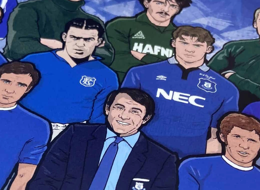
So in part it's not really Castore's fault, they didnt come up with the crest but they could have put it on a darker shield. (like Umbro did in the mid 90's).
Just something to give the crest some definition. It gets lost as it is.
Thats just my opinion
Edit. Look at the difference between the crest and kit supplier on this shirt, kinda what I'm talking about
View attachment 317199
You are using an out of date browser. It may not display this or other websites correctly.
You should upgrade or use an alternative browser.
You should upgrade or use an alternative browser.
Tipp blue
If I agreed with you, we’d both be wrong.
They are still just about half the price of the kit , I paid £115 for the home jersey.£65 for a training top with the stick on badge. I used to get a training top because they were half the price of the kit!
Davideeyore
Player Valuation: £35m
Been Castor Oil FC for the last few yearsCastore FC.
New off white away kits are a perfect match for the Everton bed wetting supporters, just blends in
TexanToffee
Player Valuation: £1.5m
I'm a sucker for collars on kits, so I'm already a fan, but this is honestly quite nice. Simple but effective.
GoldenToffee
Player Valuation: £70m
I tried it last night and honestly, if the bed sheets weren't absolutely soaked when I got up this morning after I'd dreamed of us re-signing Kack Harrison, you'd never know.New off white away kits are a perfect match for the Everton bed wetting supporters, just blends in
Not sure about that, fair few lads on the Wirral and North Wales have been raving about how great it is and how they’ll be buying it as it matches their teeth.Someone has suggested that scousers love the new away kit and non scousers can’t stand it. What do you think lads?
phil_t98
Player Valuation: £8m
2 days late to this.
But what is "better"? And how can we do better than £20m a year?
well first off am sure there are others out there who will want too be supplying us now we moved onto bigger things with the new stadium. not bad kits but don't like who we been able to buy copies of the kits before the new kits were announced
BiggyRat
Player Valuation: £35m
My two tone Umbro Polo (Blue over Navy Blue with Sportpesa collar) has only just started to have the logos peel off. I think that's 6 years of regular use so I'm not sure if that's a good outcome or not.£65 for a training top with the stick on badge. I used to get a training top because they were half the price of the kit!
barneygumble
Player Valuation: £60m
well first off am sure there are others out there who will want too be supplying us now we moved onto bigger things with the new stadium. not bad kits but don't like who we been able to buy copies of the kits before the new kits were announced
I consider these minor issues. Maybe actually a bonus! £9 and get it a month early
I know everyone will have the moans and groans about whatever, but at £20m a year, given we've been garbage for 5 years, id say we've got Castore's pants down.
Controversially, I actually love the castore gear, I think training gear is great quality.
But if any other manufacturers wants to offer us more, then I'll happily listen!
Win a couple of pots and get in the top half we've got a chance.
bigmountainfudgecake
Player Valuation: £100k
Last year's away was a beaut. Criminally underratedBy a mile the best Castore kit so far but not £80+ worth.
Sainsbur McManus
Player Valuation: £500k
I think I'm in a minority here but I think all the Castore kits so far are better than anything Hummel did for us
Toffe3m4n
Player Valuation: £80m
I didn't mind the Hummel kits by and large but yeah my biggest gripe with them were the chevrons they put on the shoulders. Didn't particularly like that personally..I think I'm in a minority here but I think all the Castore kits so far are better than anything Hummel did for us
Charles Hawtrey
Player Valuation: £50m
Its kinda their branding like the Adidas 3 stripes or the Nike swoosh.I didn't mind the Hummel kits by and large but yeah my biggest gripe with them were the chevrons they put on the shoulders. Didn't particularly like that personally..
Pesonally I thought the Hummel kits were streets ahead of anything else we have had since LCS.


