Tipp blue
If I agreed with you, we’d both be wrong.
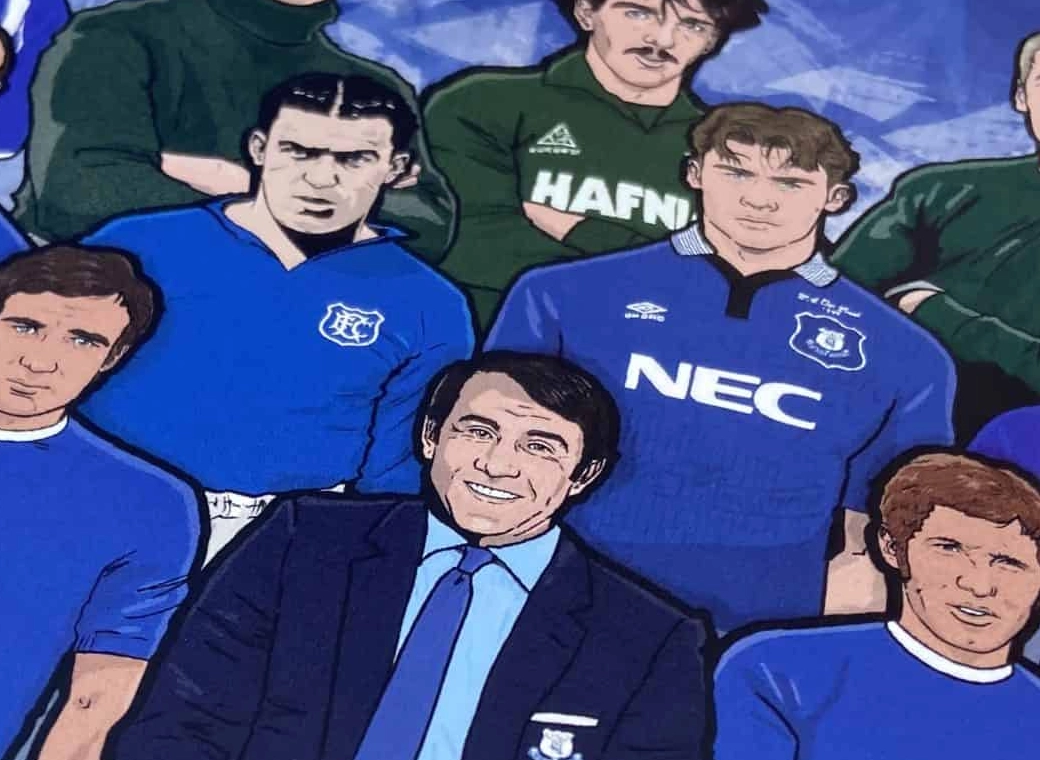
100% a good looking sponsor makes the whole Jersey look better, going with a betting company using comic sans font will cheapen the look no matter how the kit itself looks.. Toyota in simple font with their logo underneath would look good.Actually in the minority who doesn’t mind the Castore kit. It’s worth remembering it’s not possible to have a good kit wit a that monstrosity of a sponsor front and centre

