Install the app
How to install the app on iOS
Follow along with the video below to see how to install our site as a web app on your home screen.
Note: this_feature_currently_requires_accessing_site_using_safari
You are using an out of date browser. It may not display this or other websites correctly.
You should upgrade or use an alternative browser.
You should upgrade or use an alternative browser.
- Status
- Not open for further replies.
I have to confess that I didn't like it either, though I haven't seen the new one yet (i.e. next season's one).
However, the important thing is that we now have a manager who believes in our famous old motto (NSNO) even if it isn't on the team badge.
However, the important thing is that we now have a manager who believes in our famous old motto (NSNO) even if it isn't on the team badge.
Ok, I have seen the new one now. Much better that this season's attempt.
TheFinnFan
Finners
Again ffs...
toffeesnuggs
Player Valuation: £2.5m
It's just a badge to me.
Now let's go and win the league!
Now let's go and win the league!
It's awful, it looks like a Hobbit's house. What annoyed people most though was how it all came about in the first place. People at the club, likely Elstone, didn't give a monkeys about how supporters would want a say on an important issue like this, altering with the club's identity. They went and got it designed and approved without even telling anyone, it was just forced upon us without warning. Because of his arrogance and/or ignorance we got stuck with a badge no one asked for or approved off on all our merchandise, for a full year. Utterly disgraceful, he should have been sacked for the whole fiasco because it created a PR disaster for the club.
The badge we're meant to be getting next year, I'm not overly impressed with it to be honest but it's a damn sight better than the current one and it was the best option the club put forward in my opinion. I wouldn't be embarrassed to buy a shirt or a trackie with it on, whereas I am with the one we have now.
I can't wait until it's gone and hopefully afterwards we can brush this whole thing under the carpet and never have to look at or be reminded of it again.
A few friends have toddlers in the current kit and it looks great, kinda looks like it was designed for toddlers, actually didn't want this years home kit because it looked like a huge version of the toddlers kit rather than the other way around. As for the new one, not great but better.
Like next year's crest a lot. Wasn't as arsed about the current crest as most, but when I had the shirt in my hands I realized it didn't fit. Looking forward to the new crest and shirt. The old crest was fine, but I agree that it was too busy. I think the new crest is an improvement on that.
barneygumble
Player Valuation: £60m
I don't see why we have to have '1878' in the badge, does my head in, the badge looks way too crowded and busy now. If the badge is to appeal to a wider audience, who actually gives a toss if we are founded in 1878, isn't the saying loud and clearl 'Those who Understand Need No Explanation, Those That Don't Understand Don't Matter', So who cares if someone in Thailand doesn't know if we were founded in 1878.
- Status
- Not open for further replies.

Blue Skies
ORDER NOW

Everton Mishmash
Check It Out!
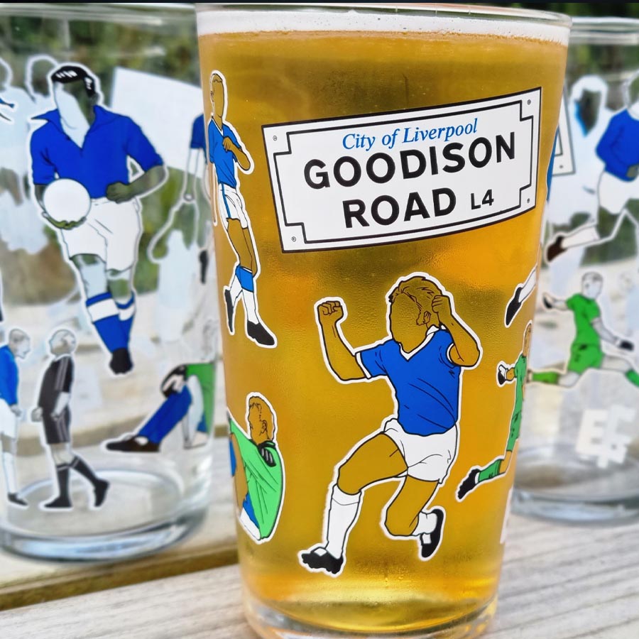
Everton Pint Glass
ORDER NOW

Support GOT
With A Subscription

The Holy Trinity Everton T-Shirt
Order Now!

Goodison Park Print
Order Now

Holy Trinity
Order Now

Legends of Goodison Park
Order Now!

Shop with Amazon
+ Support GrandOldTeam
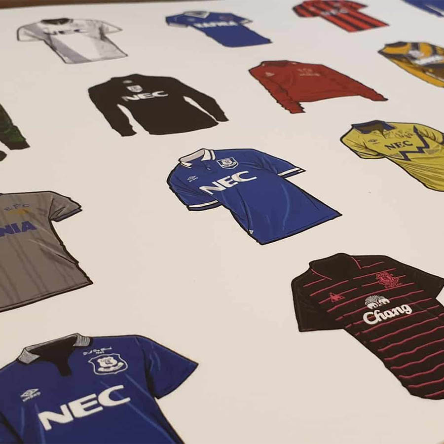
Everton Shirts
Order Now

Everton Mishmash Jigsaw
Order Now
Match Day Print
ORDER NOW

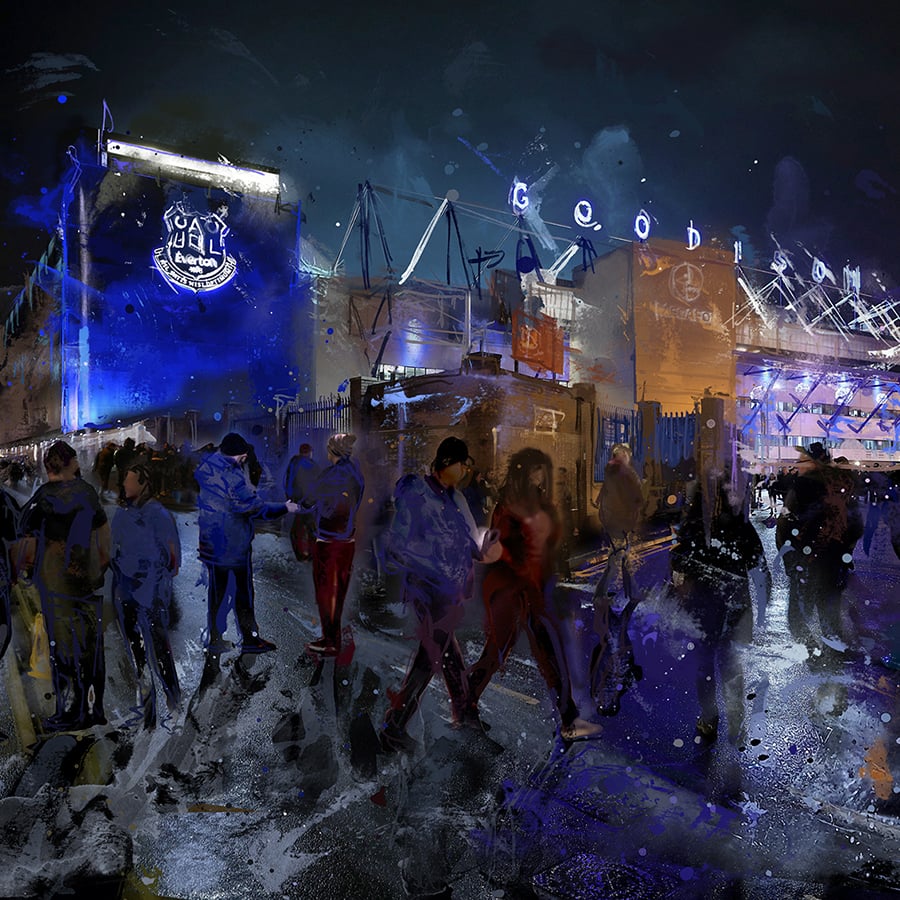
Goodison Park
ORDER NOW

Goodison Welcome
BUY NOW

Bramley Moore Everton T-Shirt
Order Now!